Flights Delay Application studies United States flights delay over 90 minutes from 2008-2016 using data from The United States Department of Transportation Bureau of Transportation Statistics. In 2015 alone, severe weather and security concerns resulted in delays of about 17.5 million minutes and undetermined causes like a previously delayed flight produced about 25 million minutes of delay, resulting in about about 1 million and 283 thousand hours of delay Bloomberg.
In light of past and current airline departure delays, this application aims to provide a useful and relevant visualization interface to departure delay analysis. Data for this application was set up in YARN-client cluster in the Hadoop server. In addition to the Shiny Application, accessible at Shiny Application, machine learning and deep learning assessment of departure delays was performed using H2O, an in-memory platform for distributed machine learning, accessible at Github. All plots for this application are visualized using plotly and leaflet. Additional used packages include the following.
library(shiny)
library(plyr)
library(dplyr)
library(mosaic)
library(base)
library(plotly)
library(ggplot2)
library(lubridate)
library(igraph)
require(visNetwork)
library(gridExtra)
library(grid)
library(leaflet)
library(ggthemes)
library(DT)
Data Collection
A sample of 200,000 observations with departure delay greater than 90 minutes was selected for analysis. Additional data like airport code names were scraped from the Air Transport Association (IATA) using packages like rvest and tools like the SelectorGadget, a Chrome extension that facilitates easy CSS webpage selection
Designing User Interface (UI)
User interface was defined with the navbarPage function from the shiny package. This features creates a page with a navigation bar that holds nested tabPanels. Application background color, #663399, as well as formatting for UI selector inputs was defined using HTML.
Data from user actions like buttons was captured using eventReactive as shown below.
df_weekend <- eventReactive(input$go, {
    DatCarrier <- data3 %>%
      filter(year >= input$yearInitial & year <= input$yearEnd) %>%
      mutate(yearF = as.factor(year)) %>%
      dplyr::group_by_("yearF", input$response) %>%
      dplyr::summarise(MeanDep = mean(dep_delay))
    return(DatCarrier)
  })
Average Departure Delay Analysis
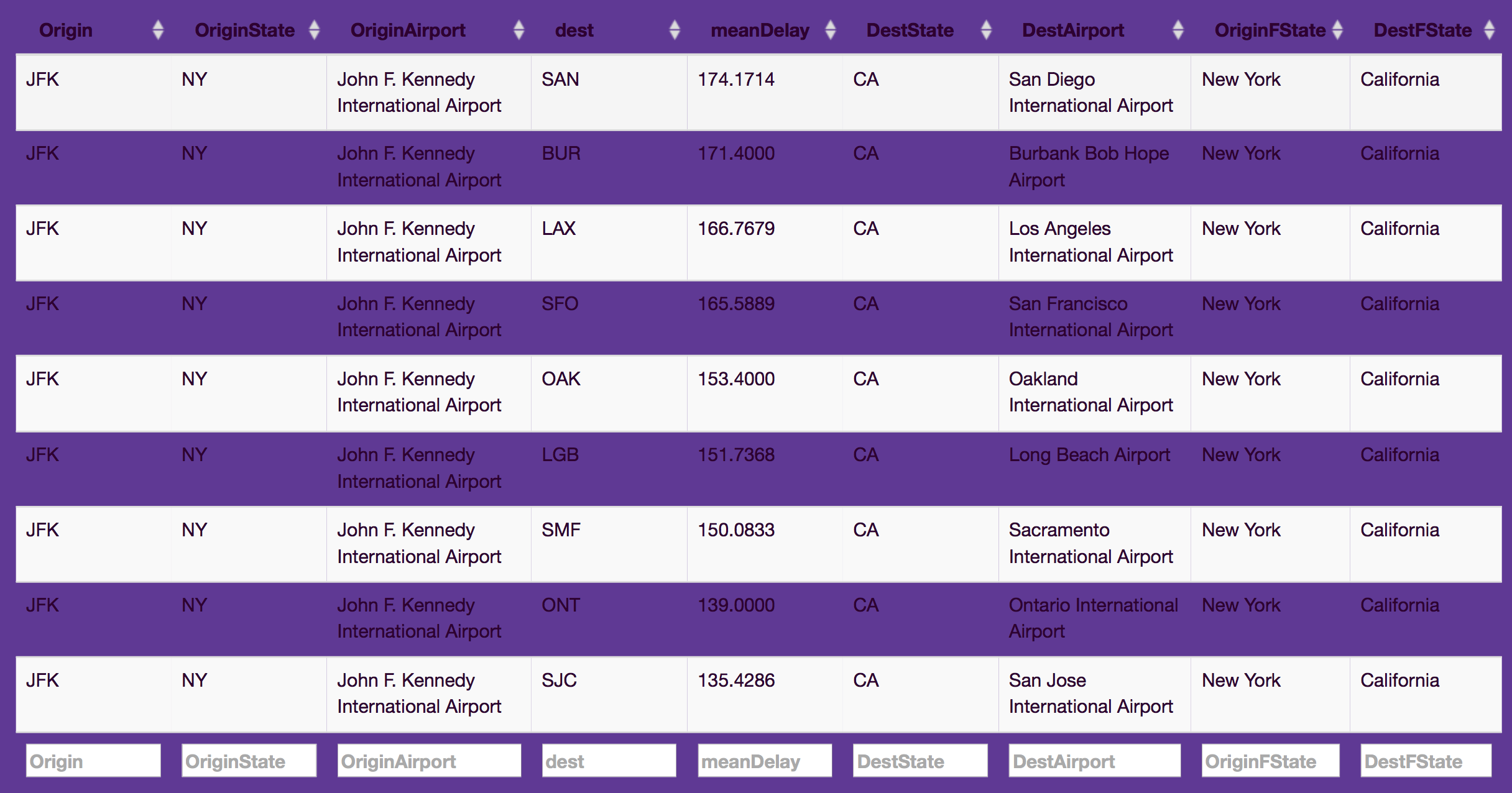
Data table, dataTableOutput, from the DT package was used to display initial departure delay analysis for flights with departure delay greater than 90 minutes from 2008-2016 with the specified origin and destination airport/state. Image below shows average departure delay for flights between New York and California.
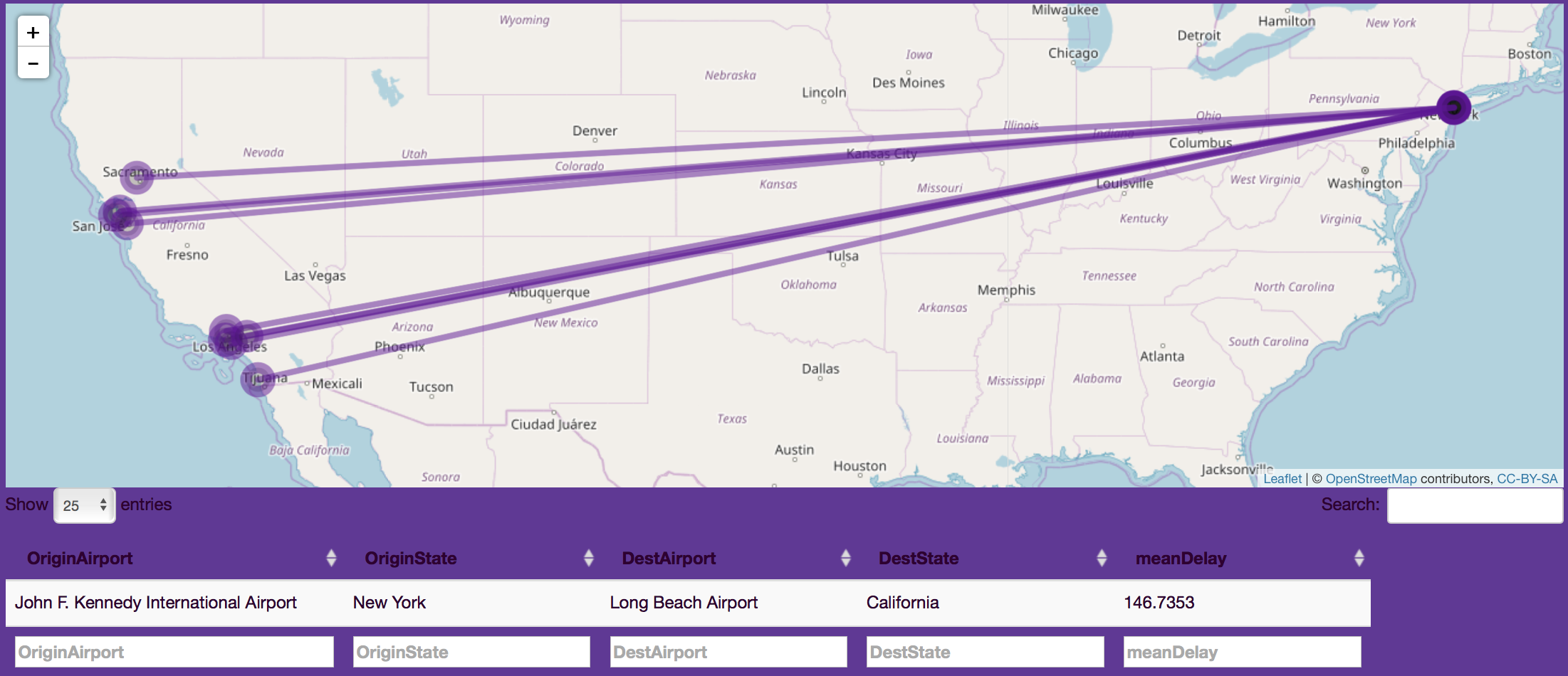
Departure Delay Paths Analysis
Departure delays were next visually assessed using leaflet maps. Path click displayed average delay in minutes for origin and destination airport/state.
output$map4 <- renderLeaflet({
    withProgress(message = "Application loading", value = 0, {
      group13 <- datMap2()
      map4 <- leaflet() %>% addTiles()
      incProgress(0.7, detail = "Building plot")
      if (nrow(group13) != 0) {
        for (i in 1:nrow(group13))
        {
          long <- cbind(group13[i, "OriginLong"], group13[i, "DestLong"])
          lat <- cbind(group13[i, "OriginLat"], group13[i, "DestLat"])
          long1 <- as.list(data.frame(t(long)))
          lat1 <- as.list(data.frame(t(lat)))

          map4 <- map4 %>% addTiles(options = providerTileOptions(noWrap = TRUE)) %>% addCircleMarkers(
            lng = long1$t.long.,
            lat = lat1$t.lat., group = "circles", color = "#660099", fillColor = "black",
            weight = (group13[i, "meanDelay"]) / 20
          ) %>% addPolylines(
            lng = long1$t.long., lat = lat1$t.lat.,
            color = "#660099"
          )
        }
        return(map4)
      }
      else {
        return(map4)
      }
      incProgress(0.3, detail = "Finishing...")
    })
  })
Image below shows average delay path between John F. Kennedy International Airport in New York and Long Beach Airport in California.
Average Departure Delay by State, Division and Region
Departure delay was next analyzed at state, region and division levels. Plots generated using plotly, which facilitated interactive user engagement, were embedded within plotlyOutput. Progress bar was wrapped around code to show plot loading time as shown.
output$plot <- renderPlotly({
    withProgress(message = "Application loading", value = 0, {
      dfweek <- df_weekend()
      incProgress(0.6, detail = "Building plot")
      p <- ggplot(dfweek, aes_string(x = "yearF", y = "MeanDep", group = input$response, color = input$response)) +
        geom_point() + geom_line(size = 1) + ggtitle(paste("Average departure delay overtime by", input$response))
      incProgress(0.4, detail = "Finishing...")
      ggplotly(p)
    })
  })
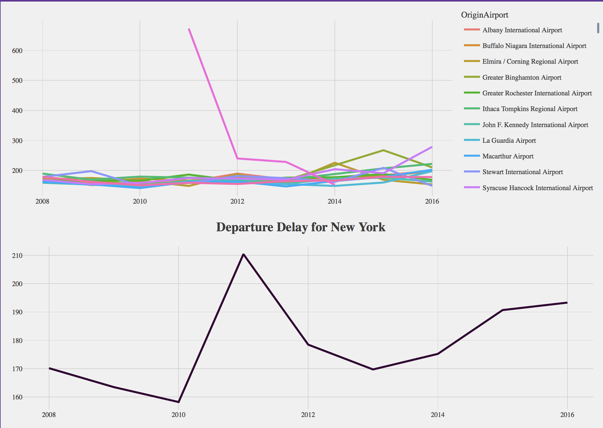
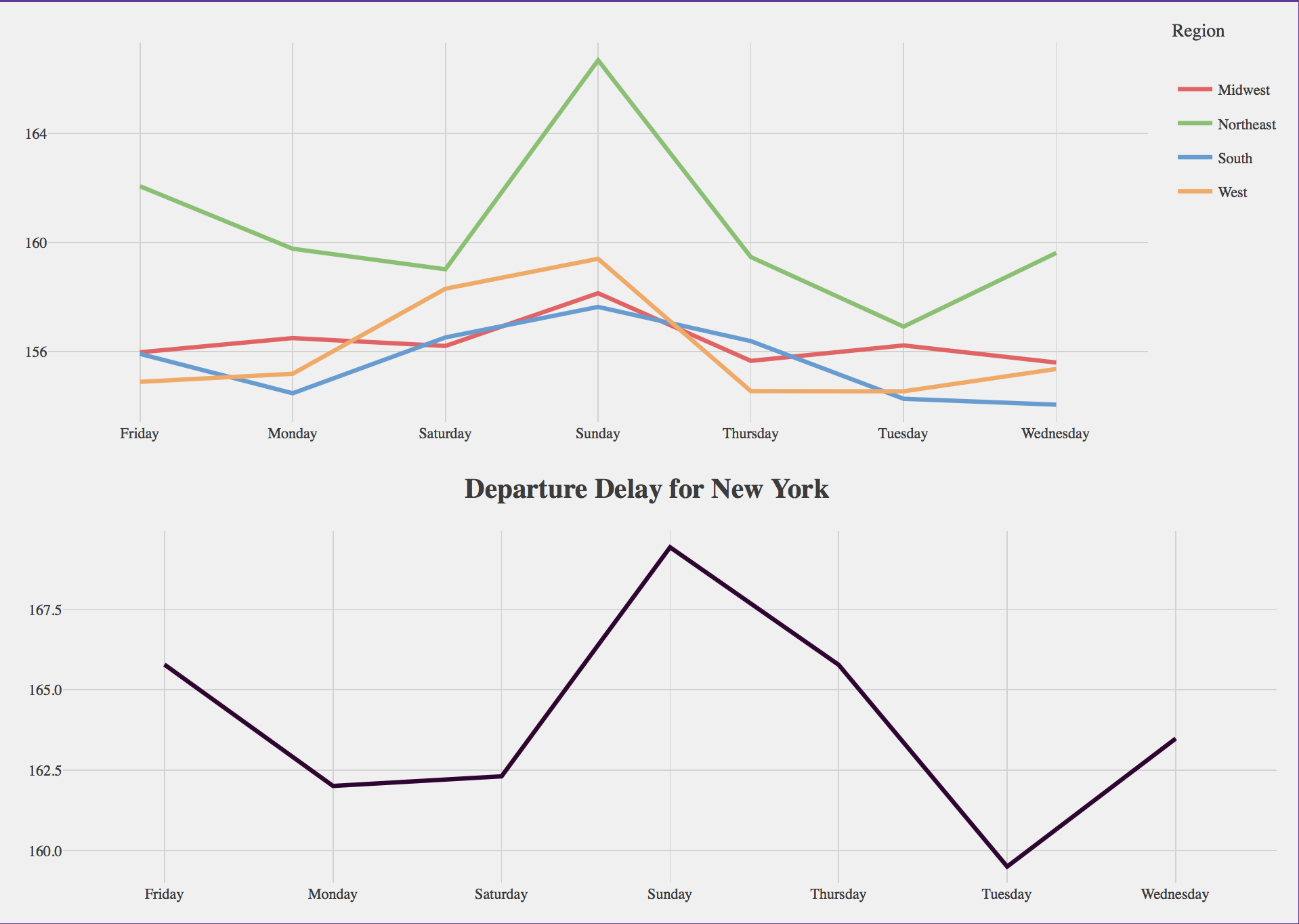
Departure delay was aggregated by state and region. Image below, for example, shows total and average departure delay by origin airport in New York.
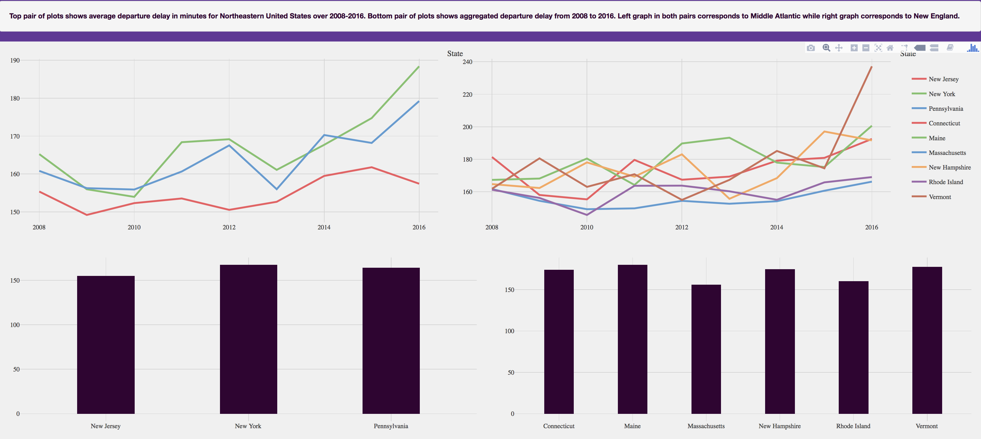
Departure delay by four regions (Midwest, Northeast, South and West) was assessed. Each region was studied by division. Midwest region was analyzed by East North Central and West North Central divisions. Northeast was analyzed by Middle Atlantic and New England divisions. South by East South Central, West South Central and South Atlantic divisions. Lastly Pacific and Mountain divisions were analyzed for Western United States. For each region, state-wide trends in the divisions for that region as well as aggregate departure delay over 2008 to 2016 were analyzed. Image below shows average departure delay over Northeast region.
Average Departure Delay by State and Region over Time by Carrier
In addition to departure delay analysis at state, region and division levels, delay was analyzed by variables like hour, day of week, weekend status, month, season and carrier type at state and region (Midwest, notheast, south, west) levels. A general trend pointed towards high delays in South and Midwest in late night/early morning hours. Northeast region appeared to have the highest delays over the week with high delays on Sunday and weekends. Departure delays in Northeast (June, July, August) were high in summer while delays in South were high in spring (April, May). Hawaiian Airlines experienced the highest delays in Northeast and West. Image below shows delay by weekday for New York and Midwest, Northeast, South and Western regions.
Aggregate Departure Delay over United States
Departure delay was lastly assessed in aggregate over United States from 2008-2016. All flights with delay greater than 90 minutes from 2008 to 2016 were filtered, resulting in about 1,590,467 observations. Filtered data was then aggregated by origin and destination airports and year to produce a smaller dataset containing 39,277 observations.
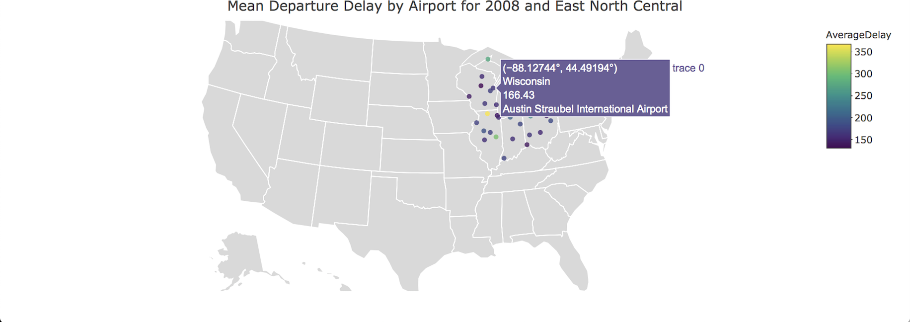
Delay was plotted using choropleth maps, which facilitate geographic level visualization by quantitative valuation. Choropleth was initialized using a plotly-geo object. Hover content, which is visible by mouse scroll, was defined by html embeddings within add_markers. Plotly-geo object was then passed in ggplotly for final plot as shown by code below.
p <- plot_geo(
  USAirSum33, locationmode = "USA-states",
  sizes = c(1, 250)
) %>%
  add_markers(
    x = ~ OriginLong, y = ~ OriginLat,
    color = ~ AverageDelay, alpha = 0.8,
    text = ~ paste(
      OriginFState, "<br />",
      AverageDelay, "<br />",
      OriginAirport
    )
  ) %>%
  layout(
    title = (paste(
      "Mean Departure Delay by Airport for",
      unique(USAirSum33$year), "and",
      unique(USAirSum33$Division)
    )),
    geo = g
  )
ggplotly(p)
Image below shows average departure delay by airport for East North Central region in 2008.