Twitter Analytics Application uses the twitteR package to perform a live profile analysis of a user (timeline and favorite tweets) and topic's tweets. This analysis is accomplished via sentiment, text, emoji and geographic analysis of a user's tweets, their tweeting habits across time metrics like hour, week, month and year and across platform metrics like Instagram, iPhone and Twitter Web Client as well as network analysis of that user's followers/following. Data analysis and visualization is performed via data tables, word cloud, bar plot, time series and network plots. Shiny application is hosted via shinyapps.io, RStudio's hosting service for Shiny apps, accessible at Shiny Application. For full code, see GitHub.
In this blog post, I highlight features of the Twitter Analytics application. I also plan to provide a brief overview of accessing and displaying API data via Shiny applications.
Following packages were used for this application.
library(shiny)
library(devtools)
library(twitteR)
library(plyr)
library(dplyr)
library(stringr)
library(wordcloud)
library(tidytext)
library(reshape2)
library(ggplot2)
library(plotly)
library(lubridate)
library(scales)
library(translate)
library(ggmap)
library(maptools)
library(maps)
library(leaflet)
library(stringi)
library(rtimes)
library(igraph)
library(visNetwork)
library(data.table)
library(mosaic)
library(RColorBrewer)
library(tidyr)
library(ggthemes)
library(Rgraphviz)
library(tm)
library(zoo)
library(slam)
library(topicmodels)
library(dichromat)
Retrieving Tweets via twitteR
All tweets for this application are retrieved using the twitteR package, which provides access to the Twitter API. Following package installation, OAuth authentication is established by setting up an API key and API secret, both of which can be retrieved from the Twitter app page. See code below for details on setting up authentication using personal consumer key and secret and access token and secret.
reqURL <- "https://api.twitter.com/oauth/request_token"
accessURL <- "https://api.twitter.com/oauth/access_token"
authURL <- "https://api.twitter.com/oauth/authorize"

set.key("KEY")

setup_twitter_oauth(consumer_key, consumer_secret, access_token, access_secret)
Tweets Table
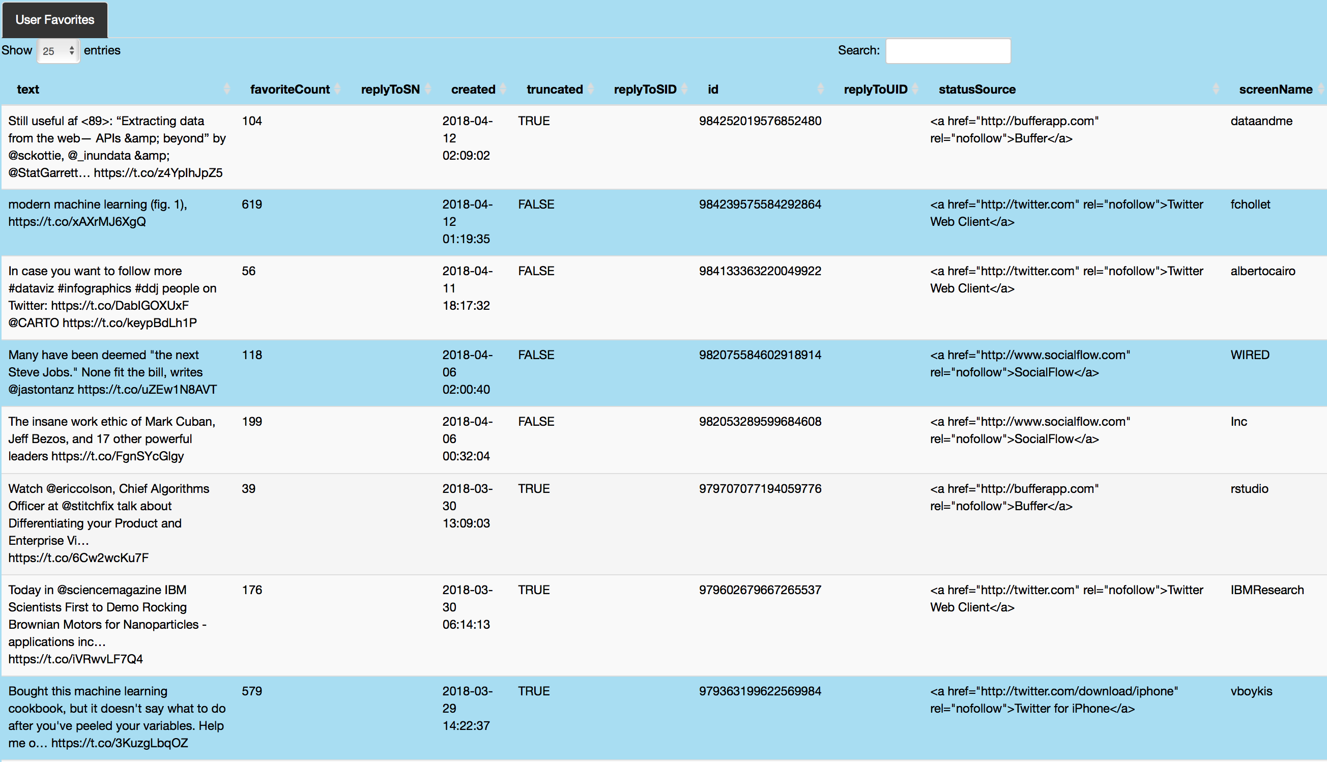
Live tweets are retrieved and displayed via dataTable for the specified user. Tweets and replies are shown in text along with tweet favorite count, replier Twitter handle, tweet creation date, retweet count and latitude and longitude information if location is indicated. The twitteR interface to the Twitter API allows for easy tweet retrieval from user timeline, user favorites as well as general topic related tweets. For example, as the code chunk below shows, the function userTimeline can be used to retrieve a user's Twitter timeline given parameters like specified number of tweets and features like excludeReplies which can be used to exclude replies from resulting data. In addition to user timelines, user favorites can be captured by the favorites function, which returns the n recently favorite tweets for a given user. Tweets related to a topic can be captured by the searchTwitter function, which searches for the specified number of tweets for a given topic/search query. Following tweet retrieval, twListToDF from the twitteR package converts the twitteR list to data.frame.
Code below shows an example retrieval of my favorite tweets from my timeline, presented in a data table.
#user input is captured in the server and action button is used to retrieve data about the specified individual's tweets.
userFavoriteData <- eventReactive(input$showUserFav, {
  withProgress(message = "Application loading", value = 0, {
    tweets <- favorites(input$twitterUser2, n = input$tweetNum2)
    incProgress(0.7, detail = "Getting favorite tweets")
    tab <- twListToDF(tweets)
    tab2 <- tab[!duplicated(tab[, c("text")]), ]
    tab2 <- tab2 %>% dplyr::select(
      text, favoriteCount, replyToSN, created, truncated, replyToSID, id, replyToUID, statusSource, screenName, retweetCount,
      isRetweet, retweeted, longitude, latitude
    )
    incProgress(0.3, detail = "Finishing...")
    return(tab2)
  })
})

output$userFavorite <- renderDataTable({
  userFavoriteData()
})
Tweets table feature also retrieves additional information about the specified individual, including his/her screen name, description, account creation date, location and user's friends, statuses and favorites count using the getUser function from the twitteR library. Following code chunk shows how retrieved information about the specified individual is stored and organized in a table.
#retrieving user information (name, screen name, description, count of friends, status and favorite tweets, account creation date and location if indicated on their public profile)
userInfoData <- eventReactive(input$showUserInfo, {
  withProgress(message = "Loading application", value = 0, {
    search.string <- input$twitterUser1
    user <- getUser(search.string) # retrieve information about a Twitter user
    incProgress(0.4, detail = "Getting user data")
    ScreenName <- user$screenName
    Name <- user$name
    Description <- user$description
    FavoritesCount <- user$favoritesCount
    FriendsCount <- user$friendsCount
    StatusCount <- user$statusesCount
    AccountCreated <- date(user$created)
    AccountCreated <- as.character(AccountCreated)
    Location <- user$location
    incProgress(0.3, detail = "Processing")
    userInfo <- cbind(
      ScreenName, Name, Description,
      FriendsCount, StatusCount, FavoritesCount,
      AccountCreated, Location
    )
    incProgress(0.3, detail = "Finishing")
    return(userInfo)
  })
})
Tweet Statistics
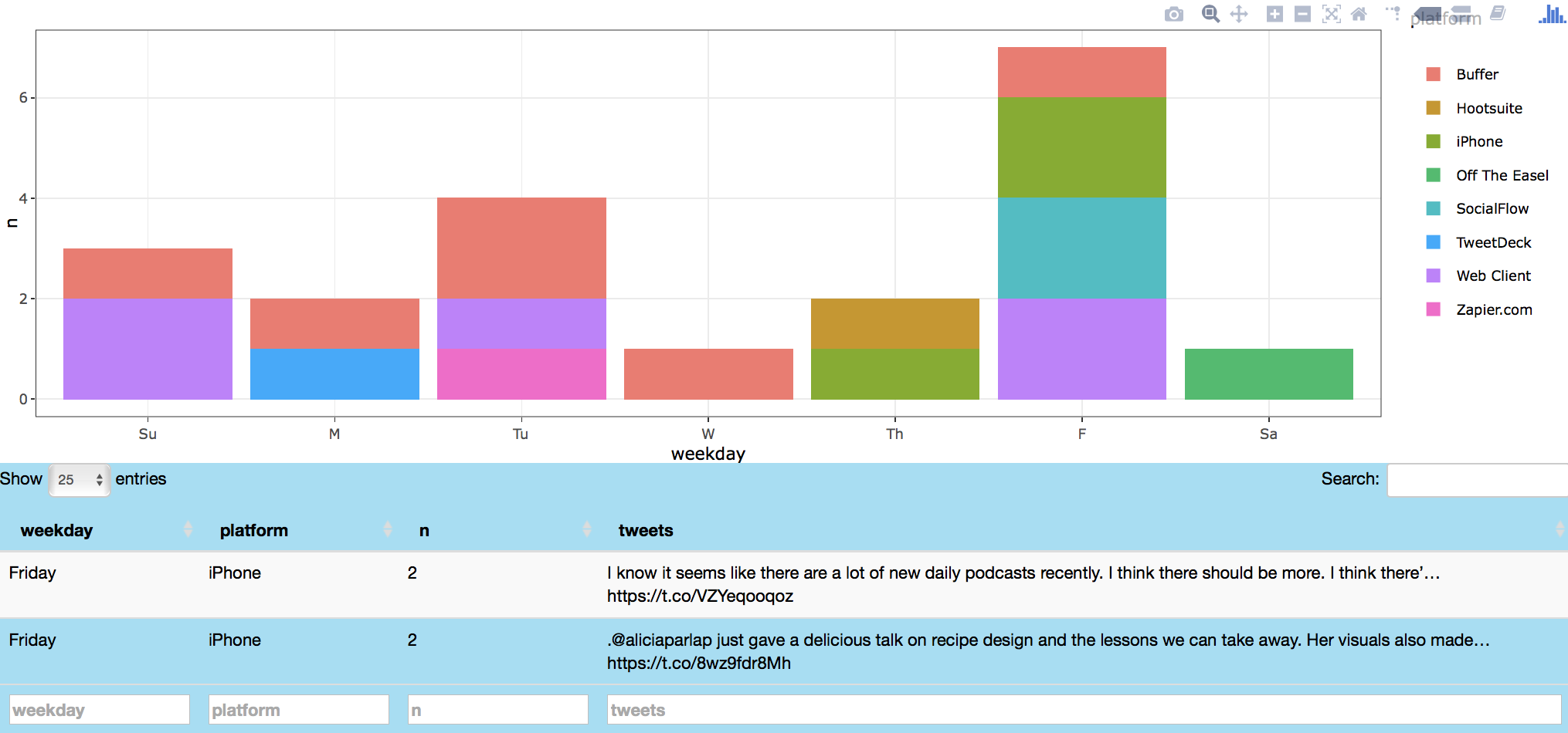
In this section, individual's Twitter use across time metrics like hour, weekday, month and year is assessed. In addition, individual's Twitter use across platforms like Hootsuite, Instagram, iPhone and Web Client is analyzed and displayed via bar plot and data table. Individual's Twitter use across time is captured by metrics like the created attribute, returned using the favorites and twListToDF functions, which indicates time and date of each tweet. The time and day metrics are parsed to obtain the year, month and day of week information for each tweet. User device (mobile, web client or platform used to send that tweet) attribute is captured by the statusSource feature. Metrics from both created and statusSource attributes are parsed and processed to produce plotly rendered bar plots (see code below for further details).
#retrieving user favorite data
tweetStatisticsData_fav <- suppressWarnings(eventReactive(input$showTweetStats_fav, {
  tweets <- favorites(input$twitterUser4_fav, n = input$tweetNum4_fav)
  tab <- twListToDF(tweets)
  tab$hour <- hour(with_tz(tab$created, "EST"))
  tab$date <- as.Date(tab$created)
  tab$year <- year(tab$date)
  tab$year <- as.factor(tab$year)
  tab$month <- as.factor(months(tab$date))
  tab$weekday <- as.factor(weekdays(tab$date))
  tab$weekday <- factor(tab$weekday, levels = c(
    "Sunday", "Monday",
    "Tuesday", "Wednesday", "Thursday", "Friday", "Saturday"
  ))
  tab$hour <- as.factor(tab$hour)

  tab$statusSource <- as.factor(tab$statusSource)
  tab$statusSource <- regmatches(tab$statusSource, gregexpr("(?<=>).*?(?=<)", tab$statusSource, perl = TRUE))
  tab$platform <- as.character(unlist(tab$statusSource))
  tab$platform <- as.factor(tab$platform)

  tab$platform <- gsub("Twitter Web Client", "Web Client", tab$platform)
  tab$platform <- gsub("Twitter for iPhone", "iPhone", tab$platform)
  tab$platform <- gsub("Twitter for Android", "Android", tab$platform)
  tab$platform <- gsub("Twitter for Mac", "Mac", tab$platform)
  tab$platform <- gsub("Twitter for iOS", "iOS", tab$platform)
  tab$platform <- gsub("Twitter for iPad", "iPad", tab$platform)
  tab$platform <- gsub("Tweetbot for Mac", "Mac bot", tab$platform)
  tab$platform <- gsub("Tweetbot for iOS", "iOS bot", tab$platform)
  tab$platform <- gsub("Meme_Twitterbot", "Meme bot", tab$platform)

  tab <- subset(tab, platform != "rtapp315156161")
  tab$weekday <- mapvalues(tab$weekday, from = c(
    "Sunday", "Monday", "Tuesday",
    "Wednesday", "Thursday", "Friday",
    "Saturday"
  ), to = c(
    "Su", "M", "Tu", "W",
    "Th", "F", "Sa"
  ))
  return(tab)
}))

#plotting user's Twitter use statistics
output$countBarPlot_fav <- renderPlotly({
  withProgress(message = "Application loading", value = 0, {
    incProgress(0.7, detail = "Getting tweets")
    tab <- tweetStatisticsData_fav()
    join5 <- tab %>% dplyr::group_by_(input$chooseTime_Platform1_fav, input$chooseTime_Platform2_fav) %>% dplyr::summarise(word = paste(text, collapse = "a`"), n = n())
    join5$n <- as.numeric(join5$n)
    for (i in 1:nrow(join5))
    {
      join5$word[i] <- paste(unique((strsplit(join5$word[i], "\n"))[[1]]), collapse = "\n")
    }
    tab <- join5
    tab$count <- as.factor(as.character(tab$n))
    incProgress(0.3, detail = "Plotting")
    if ((input$chooseTime_Platform2_fav) == "hour") {
      tab <- as.data.frame(tab)
      tab[, 2] <- as.numeric(as.character(tab[, 2]))
      p2 <- ggplot(tab, aes_string(x = input$chooseTime_Platform1_fav, y = "n", fill = input$chooseTime_Platform2_fav)) +
        geom_bar(stat = "identity") + theme_bw()
      ggplotly(p2, tooltip = c("x", "fill", "y"), source = "countBarPlot_fav")
    }
    else {
      p2 <- ggplot(tab, aes_string(x = input$chooseTime_Platform1_fav, y = "n", fill = input$chooseTime_Platform2_fav)) +
        geom_bar(stat = "identity") + theme_bw()
      ggplotly(p2, tooltip = c("x", "fill", "y"), source = "countBarPlot_fav")
    }
  })
})
Image below shows data about my (azkajavaid17) favorite tweets by day of week and tweet platform. Plot click shows my favorite tweets on Friday via iPhone (on podcasts and data visualization) in a table format.
Word Cloud
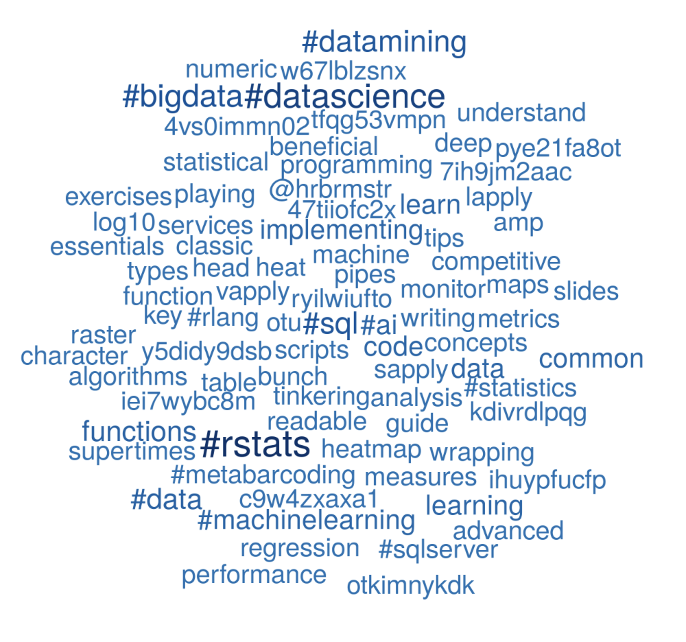
Word cloud analysis is performed next to visualize user/topic's tweets. As code below shows, tweets related to #rstats are initially captured by the searchTwitter function and processed to remove retweets and stop words following tokenization. After text processing, words are tallied and arranged in descending order. Finally this dataset is used for plotting via wordcloud from the wordcloud library. The sequential descending order of tallied words is visualized by color gradation, achieved by passing the darker hues of the blues palette as an input to the brewer.pal function from the RColorBrewer package. These shades are then passed as an input to the colorRampPalette from the dichromat package, which interpolates these colors to create a new palette. This new palette is then fed into the colors attribute of the wordcloud function. In addition to the wordcloud, dotplot indicating words and attributed counts is plotted using ggplot and rendered to a plotly object using ggplotly from the plotly package. The tooltip attribute of the ggplotly function is used to highlight specified features with a user hover (word label and count), thereby providing an interactive experience for the app user.
#retrieving topic related tweets
topicCloudData <- eventReactive(input$showTopicCloud, {
  tweets <- searchTwitter(input$twitterUser7, n = input$tweetNum7)
  tab <- twListToDF(tweets)
  reg <- "([^A-Za-z_\\d#@']|'(?![A-Za-z_\\d#@]))"
  tab2 <- tab %>%
    dplyr::filter(!str_detect(text, "^RT")) %>%
    dplyr::mutate(text = str_replace_all(text, "http\\w+", "")) %>%
    unnest_tokens(word, text, token = "regex", pattern = reg) %>%
    dplyr::filter(
      !word %in% stop_words$word,
      str_detect(word, "[a-z]")
    )
  tab2 <- tab2 %>% dplyr::group_by(word) %>% dplyr::summarise(n = n()) %>% dplyr::arrange(desc(n))
  return(tab2)
})

#plotting word cloud of user/topic's tweets
output$tweetTopicCloud <- renderPlot({
  withProgress(message = "Application loading", value = 0, {
    col <- list(colorRampPalette(brewer.pal(9, "Blues"))(50))[[1]][37:50]
    incProgress(0.3, detail = "Building word cloud")
    tab <- topicCloudData()
    incProgress(0.7, detail = "Finishing...")
    tab2 <- subset(tab, n >= input$minWords3)
    wordcloud(
      words = tab2$word, freq = tab2$n, min.freq = input$minWords3, scale = c(3, 2), rot.per = 0,
      colors = col
    )
  })
})

#table of raw word cloud counts for topic tweets
output$topicTweetsCloudTab <- renderPlotly({
  tab <- topicCloudData()
  incProgress(0.3, detail = "Building table")
  tab2 <- subset(tab, n >= input$minWords3)
  tab2 <- plyr::rename(tab2, replace = c("word" = "Word"))
  tab2 <- plyr::rename(tab2, replace = c("n" = "WordCount"))
  incProgress(0.7, detail = "Finishing...")
  y.text <- element_text(size = 8)

  tab2$Word <- factor(tab2$Word, levels = tab2$Word[order(tab2$WordCount)])
  favTweets <- ggplot(tab2, aes(x = WordCount, y = Word)) + geom_point(size = 2, color = "#2575B7") +
    ggtitle("Word Cloud Count") + theme_bw() + theme(axis.title.y = element_blank(), axis.text.y = y.text)
  ggplotly(favTweets, tooltip = c("x", "y"))
})
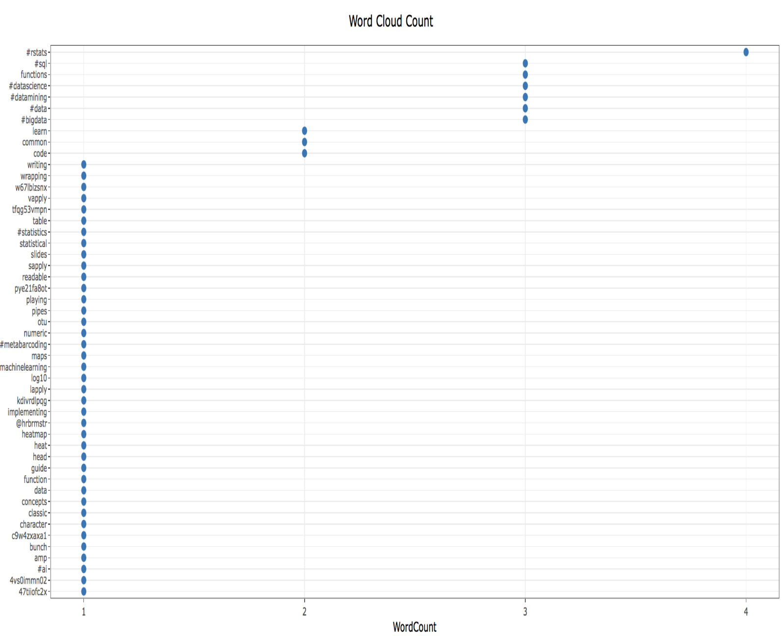
Image below shows word cloud and dot plot data related to topic tweets about #rstats. Word cloud terms include sapply, #machinelearning, #sql and #ai amongst others.
 .
.
The associated dotplot shows frequency of words mentioned most often in tweets related to #rstats, including #sql, functions, #datascience, #datamining and #data.
 .
.
Topic Modeling
Next feature performs topic modeling to classify user tweets using Latent Dirichlet allocation (LDA). As code chunk below shows, text for the specified user is processed as input along with the tweet number and topic count. Retrieved tweets are converted to a corpus and transformed to a Document Term Matrix (DTM). The DTM is further processed using the tidy function from the tidytext package (originally from the broom package), which is used to extract per-topic-per-word probabilities (beta). Tidied data is then fed into the LDA function from the topicmodels package and further processed to produce the topics plot using ggplotly.
#retrieving user favorite tweets
userFavTopicData <- eventReactive(input$showTopicModelFavorite, {
  withProgress(message = "Application loading", value = 0, {
    tweets <- favorites(input$twitterUser2_topic, n = input$tweetNum2_topic)
    tab <- twListToDF(tweets)

    reg <- "([^A-Za-z_\\d#@']|'(?![A-Za-z_\\d#@]))"
    tab2 <- tab %>%
      dplyr::filter(!str_detect(text, "^RT")) %>%
      dplyr::mutate(text = str_replace_all(text, "http\\w+", ""))

    tweets <- sapply(tab2$text, function(row) iconv(row, "latin1", "ASCII", sub = ""))

    incProgress(0.6, detail = "Collecting Tweets...")
    corpus <- Corpus(VectorSource(tweets))
    corpus <- tm_map(corpus, removePunctuation)
    corpus <- tm_map(corpus, stripWhitespace)
    corpus <- tm_map(corpus, tolower)
    corpus <- tm_map(corpus, removeWords, stopwords("english"))
    tdm <- DocumentTermMatrix(corpus)

    term_tfidf <- tapply(tdm$v / row_sums(tdm)[tdm$i], tdm$j, mean) * log2(nDocs(tdm) / col_sums(tdm > 0))

    incProgress(0.4, detail = "Finishing...")
    tdm <- tdm[, term_tfidf >= 0.1]
    tdm <- tdm[row_sums(tdm) > 0, ]
    return(tdm)
  })
})

#output topic plot using ggplotly
output$userFavoritesTopic <- renderPlotly({
  tdm <- userFavTopicData()

  chapters_lda <- LDA(tdm, k = input$topicNumber2_topic, control = list(seed = 900))
  chapter_topics <- tidy(chapters_lda, matrix = "beta")

  top_terms <- chapter_topics %>%
    group_by(topic) %>%
    top_n(input$topWords2User, beta) %>%
    ungroup() %>%
    arrange(topic, -beta)

  top_terms$term <- as.factor(top_terms$term)
  topicPlot <- top_terms %>%
    mutate(term = reorder(term, beta)) %>%
    ggplot(aes(term, beta)) +
    facet_wrap(~ topic, scales = "free") + coord_flip() + geom_point(size = 2, colour = "#00aced") + theme_bw() + theme(axis.text.y = element_text(size = 8))

  ggplotly(topicPlot)
})
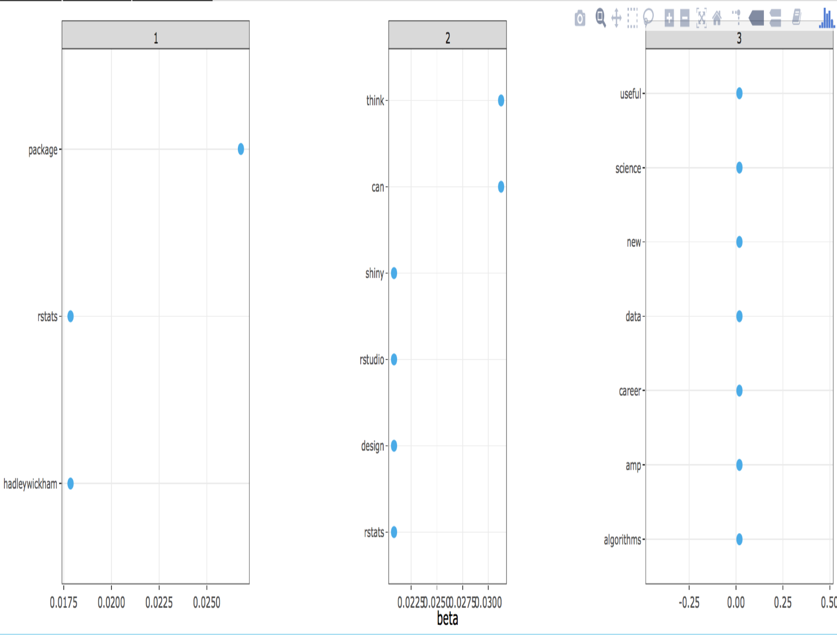
Following image shows a topic model of my recent favorite tweets (azkajavaid17), classifying them in three topics. While the topic labels cannot be distinctly determined, the first topic aligns towards package development (rstats, package, hadleywickham), second topic fits into data visualization platforms (shiny, design) and third topic relates to career development (career, science).
Sentiment Analysis
Word Cloud
Following topic modeling, sentiment analysis was performed using Julia Silge and David Robinson's tidytext package. Given a specified user and tweet number, sentiment word cloud, bar plot and time series are produced. Interactive time series feature also allows retrieval of tweets associated with either positive/negative sentiment for the clicked date. Sentiment analysis is performed using the sentiments data from the tidytext package, which contains data from three different lexicons. Lexicons include data from the NRC Emotion Lexicon from Saif Mohammad and Peter Turney, the sentiment lexicon from Bing Liu and collaborators, of Finn Arup Nielsen, and of Tim Loughran and Bill Loughran. NRC lexicon is used for this work. As following code shows, initial data processing for word cloud, bar plot and time series is similar to the processing used to produce word cloud in the previous section. Data processing includes removal of retweets, tokenization and stop words removal. The processed data is then joined with the sentiments dataset, which facilitates labeling of words by positive/negative sentiment, followed by eventual plotting as a comparison cloud (see sentimentWordCloud code chunk for further information about data processing and visualization).
## server
userSentimentData <- eventReactive(input$showWordBarSentiment, {
tweets <- userTimeline(input$twitterUser8, n = input$tweetNum8)
incProgress(0.3, detail = "Getting topic tweets")
tab <- twListToDF(tweets)
tab3 <- unique(tab)
reg <- "([^A-Za-z_\\d#@']|'(?![A-Za-z_\\d#@]))"
tab4 <- tab3 %>%
dplyr::filter(!str_detect(text, "^RT")) %>%
dplyr::mutate(text2 = str_replace_all(text, "https://t.co/[A-Za-z\\d]+|http://[A-Za-z\\d]+|&|<|>|RT|https", ""))
tab4 <- tab4 %>%
unnest_tokens(word, text2, token = "regex", pattern = reg) %>%
dplyr::filter(!word %in% stop_words$word, str_detect(word, "[a-z]"))
tab4$date <- as.Date(tab4$created)
return(tab4)
})
## Building sentiment word cloud
output$sentimentWordCloud <- renderPlot({
withProgress(message = "Application loading", value = 0, {
join7 <- userSentimentData()
wordTab <- join7 %>% dplyr::group_by(word) %>% dplyr::summarise(n = n()) %>% dplyr::arrange(desc(n))
incProgress(0.6, detail = "Building word cloud")
join1 <- inner_join(wordTab, sentiments, by = c("word" = "word"))
join2 <- subset(join1, lexicon == "nrc")
join3 <- dplyr::filter(join2, sentiment %in% c("positive", "negative"))
join4 <- join3 %>% dplyr::mutate(score = ifelse(sentiment == "negative", -1 * n, n))
incProgress(0.4, detail = "Finishing...")
join4 %>%
dplyr::arrange(desc(n)) %>%
acast(word ~ sentiment, value.var = "n", fill = 0) %>%
comparison.cloud(
colors = c("#F8766D", "#00BFC4"),
max.words = input$wordCloudNum
)
})
})
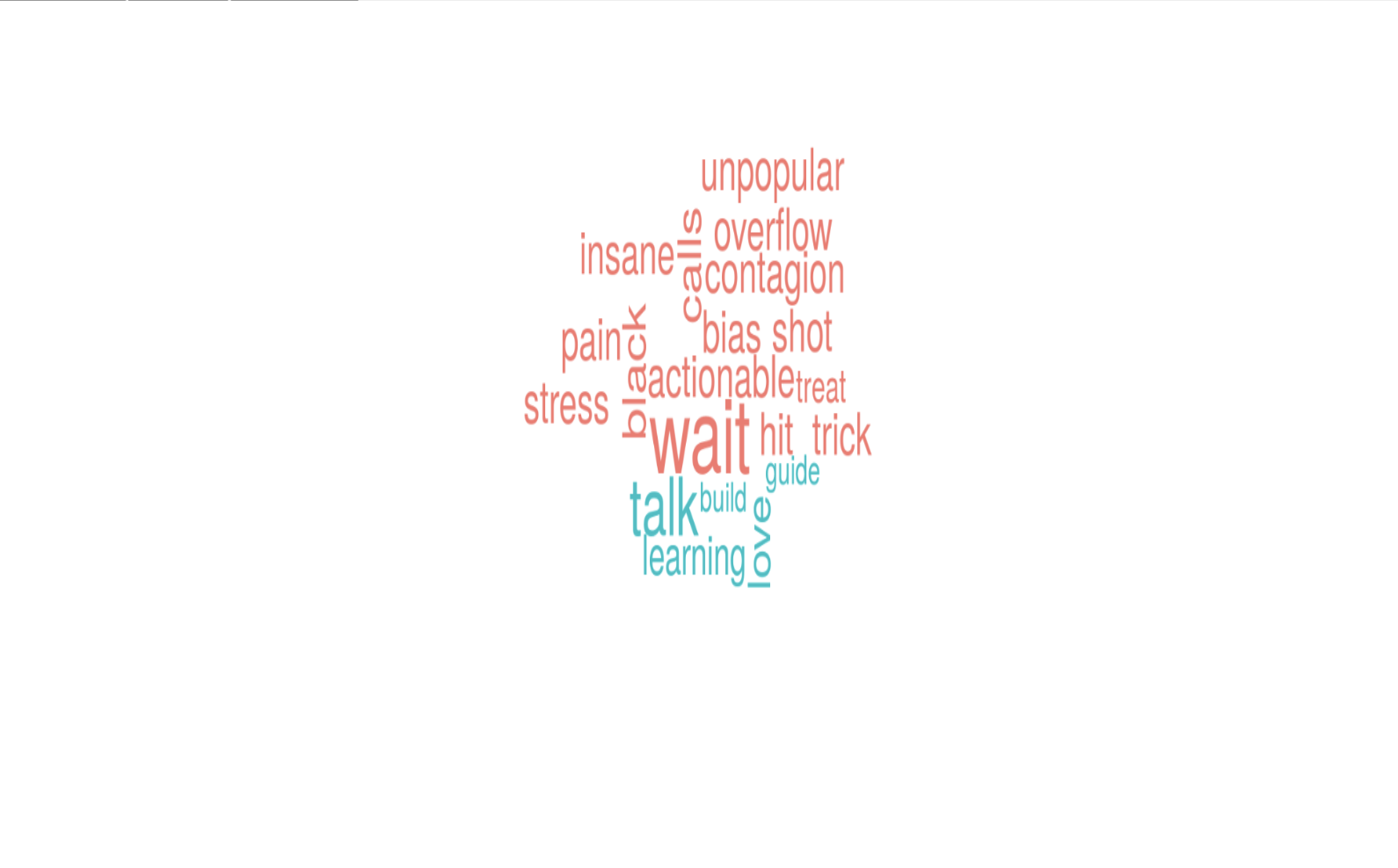
Image below shows a word cloud sentiment analysis of my favorite tweets.
Sentiment Bar Plot
Sentiment bar plot is produced in a similar fashion as the sentiment word cloud and aims to provide a different method of visualizing the same sentiment data.
## Preparing data for sentiment time series
 ## Building sentiment bar plot
output$sentimentBarPlot <- renderPlot({
  withProgress(message = "Application loading", value = 0, {
    join7 <- userSentimentData()
    wordTab <- join7 %>% dplyr::group_by(word) %>% dplyr::summarise(n = n()) %>% dplyr::arrange(desc(n))
    incProgress(0.6, detail = "Building bar plot")
    join1 <- inner_join(wordTab, sentiments, by = c("word" = "word"))
    join2 <- subset(join1, lexicon == "nrc")
    join3 <- dplyr::filter(join2, sentiment %in% c("positive", "negative"))
    join4 <- join3 %>% dplyr::mutate(score = ifelse(sentiment == "negative", -1 * n, n))
    incProgress(0.4, detail = "Finishing...")
    join4 %>%
      dplyr::arrange(desc(score)) %>%
      dplyr::group_by(sentiment) %>%
      top_n(n = input$barplotNum, abs(score)) %>%
      dplyr::mutate(word = reorder(word, score)) %>%
      ggplot(aes(x = reorder(word, -score), score, fill = score > 0)) +
      geom_bar(stat = "identity", show.legend = FALSE) +
      coord_flip() + theme_bw()
  })
})
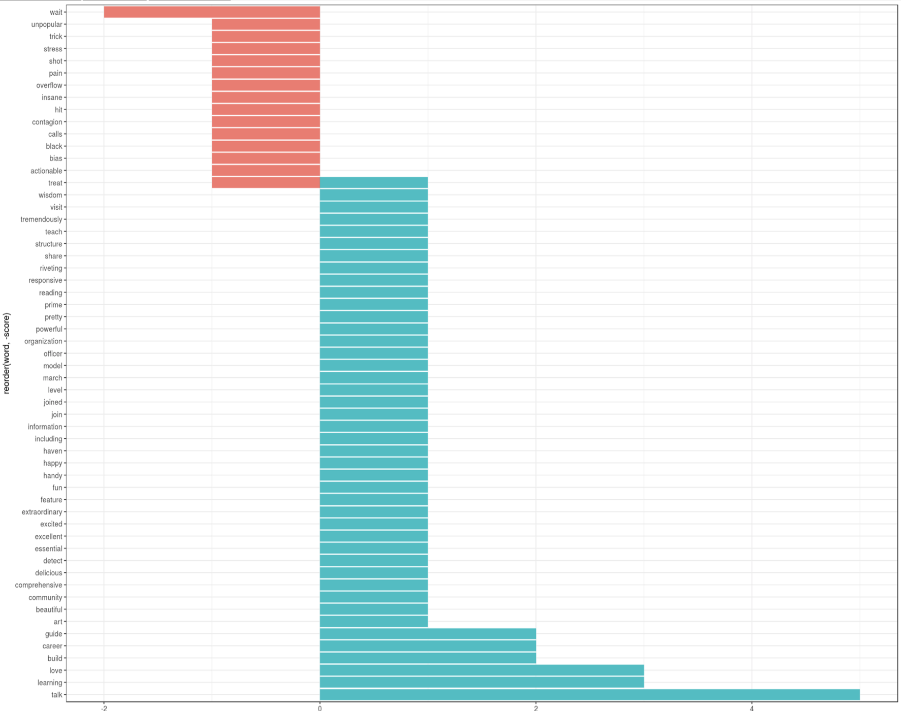
Image below shows a bar plot sentiment analysis of my favorite tweets.
Sentiment Time Series
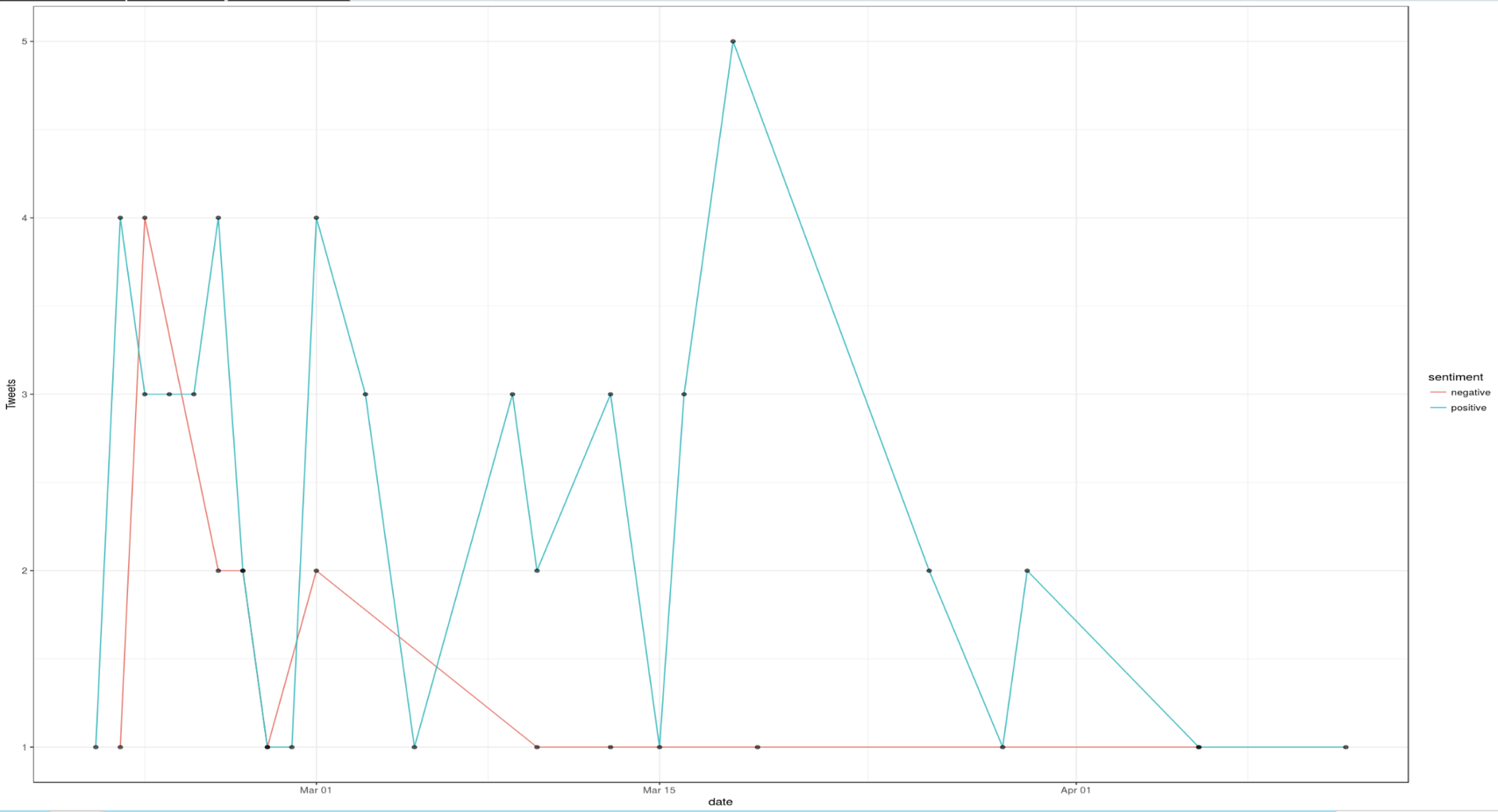
Lastly, time series plot is used to visualize sentiment data over time using ggplot. An interesting and valuable feature of the time series plot is that an app user can retrieve the tweets associated with a positive/negative sentiment for a specified date. This retrieval is made possible by defining a click argument (plot1_click) in plotOutput. Plot1_click is then passed as an argument to the nearPoints function from the shiny package, which returns observations (tweets) near the clicked point, associated with the nearest date and sentiment.
## Building sentiment time series
output$sentimentTimeSeries <- renderPlot({
  withProgress(message = "Application loading", value = 0, {
    join7 <- userSentimentData()
    incProgress(0.6, detail = "Constructing time series")
    join1 <- inner_join(join7, sentiments, by = c("word" = "word"))
    join2 <- subset(join1, lexicon == "nrc")
    join3 <- dplyr::filter(join2, sentiment %in% c("positive", "negative"))
    join4 <- join3 %>% dplyr::select(word, sentiment, date, text)
    join4$word <- as.character(join4$word)
    join4$sentiment <- as.character(join4$sentiment)
    join5 <- join4 %>% dplyr::group_by(sentiment, date) %>% dplyr::summarise(word = paste(text, collapse = "a`"), n = n())
    join5$n <- as.numeric(join5$n)
    for (i in 1:nrow(join5))
    {
      join5$word[i] <- paste(unique((strsplit(join5$word[i], "\n"))[[1]]), collapse = "\n")
    }
    incProgress(0.2, detail = "Finishing...")
    join5 <- plyr::rename(join5, replace = c("n" = "Tweets"))
    incProgress(0.2, detail = "Plotting...")
    p <- ggplot(data = join5, aes(x = date, y = Tweets)) + geom_line(aes(colour = sentiment)) +
      geom_point(alpha = 0.6, size = 1.5, aes(text = word)) + theme_bw()
    p + (scale_x_date(labels = date_format("%b %y")))
    p
  })
})

## Preparing to show point/sentiment specific tweets
output$sentimentInfo <- renderDataTable({
  withProgress(message = "Application loading", value = 0, {
    join7 <- userSentimentData()
    incProgress(0.4, detail = "Constructing time series")
    join1 <- inner_join(join7, sentiments, by = c("word" = "word"))
    join2 <- subset(join1, lexicon == "nrc")
    join3 <- dplyr::filter(join2, sentiment %in% c("positive", "negative"))
    join4 <- join3 %>% dplyr::select(word, sentiment, date, text)
    join4$word <- as.character(join4$word)
    join4$sentiment <- as.character(join4$sentiment)
    join5 <- join4 %>% dplyr::group_by(sentiment, date) %>% dplyr::summarise(word = paste(text, collapse = "a`"), n = n())
    join5$n <- as.numeric(join5$n)
    for (i in 1:nrow(join5))
    {
      join5$word[i] <- paste(unique((strsplit(join5$word[i], "\n"))[[1]]), collapse = "\n")
    }
    incProgress(0.3, detail = "Processing...")
    join5 <- plyr::rename(join5, replace = c("n" = "Tweets"))
    if (is.null(input$plot1_click) == TRUE) {
      dat <- data.frame("Click a point to see relevant tweets by sentiment")
      colnames(dat) <- "Click a point to see relevant tweets by sentiment"
      dat[, 1] <- ""
      return(dat)
    }
    else {
      dat <- nearPoints(join5, input$plot1_click, addDist = TRUE)
      dat1 <- as.data.frame(dat)
      dat2 <- dat1 %>% dplyr::select(sentiment, date, word)
      dat4 <- as.data.frame(dat2) %>% mutate(V3 = strsplit(as.character(word), "a`")) %>% unnest(V3)
      dat5 <- dat4 %>% dplyr::select(sentiment, date, V3)
      incProgress(0.3, detail = "Finishing...")
      dat5 <- plyr::rename(dat5, replace = c("V3" = "tweets"))
      return(unique(dat5))
    }
  })
})
Image below shows a time series sentiment analysis of my favorite tweets.
Geographic Analysis
Mapping Trends
Next feature of this application, Mapping Trends, facilitates geographic specific trend analysis. Trend analysis is performed at a global level since multilingual tweets are translated to English using the Google Translation API. Trends per location are captured using the app user's click via the map_click input. From the map_click, latitude and longitude are extracted and passed as parameters to the revgeocode function, from the ggmap package, which geocodes a longitude/latitude location using Google Maps. Latitude and longitude coordinates are then passed in to the closestTrendLocation function from the twitteR package to retrieve the woeid, which is a 32-bit reference identifier assigned by Yahoo! that identifies features on Earth. The woeid is then passed into the getTrends function which returns the trends associated with that woeid. All trends are collected and translated in English using the translate function from the translate package. Tweet translation is performed in English from the original language, which is detected using the detect.source function from the translate package.
leafletOutput("map")

#trend analysis
trendsData <- eventReactive(input$map_click, {
  address <- try(revgeocode(c(click$lng, click$lat)))
  click <- input$map_click
  clng <- click$lng
  clat <- click$lat
  leafletProxy("map") %>%
    addCircles(
      lng = clng, lat = clat, group = "circles",
      weight = 20, radius = 100, color = "#0033FF",
      popup = address, fillOpacity = 0.5, opacity = 1
    )

  addressClick <- click

  progress4 <- shiny::Progress$new()
  on.exit(progress4$close())
  progress4$set(message = "Calculating trends", value = 0)

  clat <- addressClick$lat
  clng <- addressClick$lng
  obs <- closestTrendLocations(clat, clng)
  woe <- obs["woeid"]$woeid
  trends <- getTrends(woe)
  trend <- trends$name

  empt <- list()
  for (i in 1:nrow(trends))
  {
    trends$name[i] <- gsub("([[:upper:]])", " \\1", trends$name[i])
    trans <- translate(trends$name[i], detect.source(trends$name[i])[[1]], "en")
    if (length(trans) == 0) {
      trends$name[i] <- str_replace(gsub("\\s+", " ", str_trim(trends$name[i])), "B", "b")
      trends$name[i] <- gsub(" ", "", trends$name[i])
      empt <- rbind(empt, trends$name[i])
    }
    else {
      trans <- str_replace(gsub("\\s+", " ", str_trim(trans)), "B", "b")
      trans <- gsub(" ", "", trans)
      empt <- rbind(empt, trans)
    }
    progress4$inc(1 / i, detail = paste("Calculating trend", i))
  }

  empt2 <- data.frame(empt)
  total <- cbind(trend, empt2)
  total <- plyr::rename(total, c("empt" = "translation"))

  clat <- addressClick$lat
  clng <- addressClick$lng
  latitude <- paste("Latitude:", round(clat, 3), "Longitude:", round(clng, 3))

  address <- try(revgeocode(c(clng, clat)))
  address1 <- paste("Address:", address)

  total2 <- cbind(total, latitude)
  total3 <- cbind(total2, address1)
  total3$translation <- as.factor(as.character(total3$translation))
  total3$trend <- as.factor(as.character(total3$trend))
  return(total3)
})

output$map <- renderLeaflet({
  leaflet() %>%
    setView(lng = -73.9442, lat = 40.6782, zoom = 8) %>%
    addTiles(options = providerTileOptions(noWrap = TRUE))
})
Tweets related to a trend are next captured, translated and displayed in a table.
### Retrieve 10 tweets for the specified trend
mapTrendsTweet <- eventReactive(input$showTrends, {
  withProgress(message = "Application loading", value = 0, {
    tweets <- searchTwitter(input$showTweetTrend, n = 10)
    incProgress(0.6, detail = "Getting tweets")
    tab <- twListToDF(tweets)
    text <- unique(tab$text)
    incProgress(0.3, detail = "Translating tweets")
    transl <- list()
    for (i in 1:length(text))
    {
      trans <- (translate(text[i], detect.source(text[i])[[1]], "en"))
      if (length(trans) == 0) {
        transl <- rbind(transl, text[i])
      }
      else {
        transl <- rbind(transl, trans)
      }
    }
    transl <- data.frame(transl)
    trendData <- cbind(text, transl)
    trendData <- plyr::rename(trendData, replace = c("text" = "Tweet"))
    trendData <- plyr::rename(trendData, replace = c("transl" = "Translated"))
    incProgress(0.1, detail = "Finishing...")
    return(trendData)
  })
})

output$tweetTable <- renderDataTable({
  return(mapTrendsTweet())
})
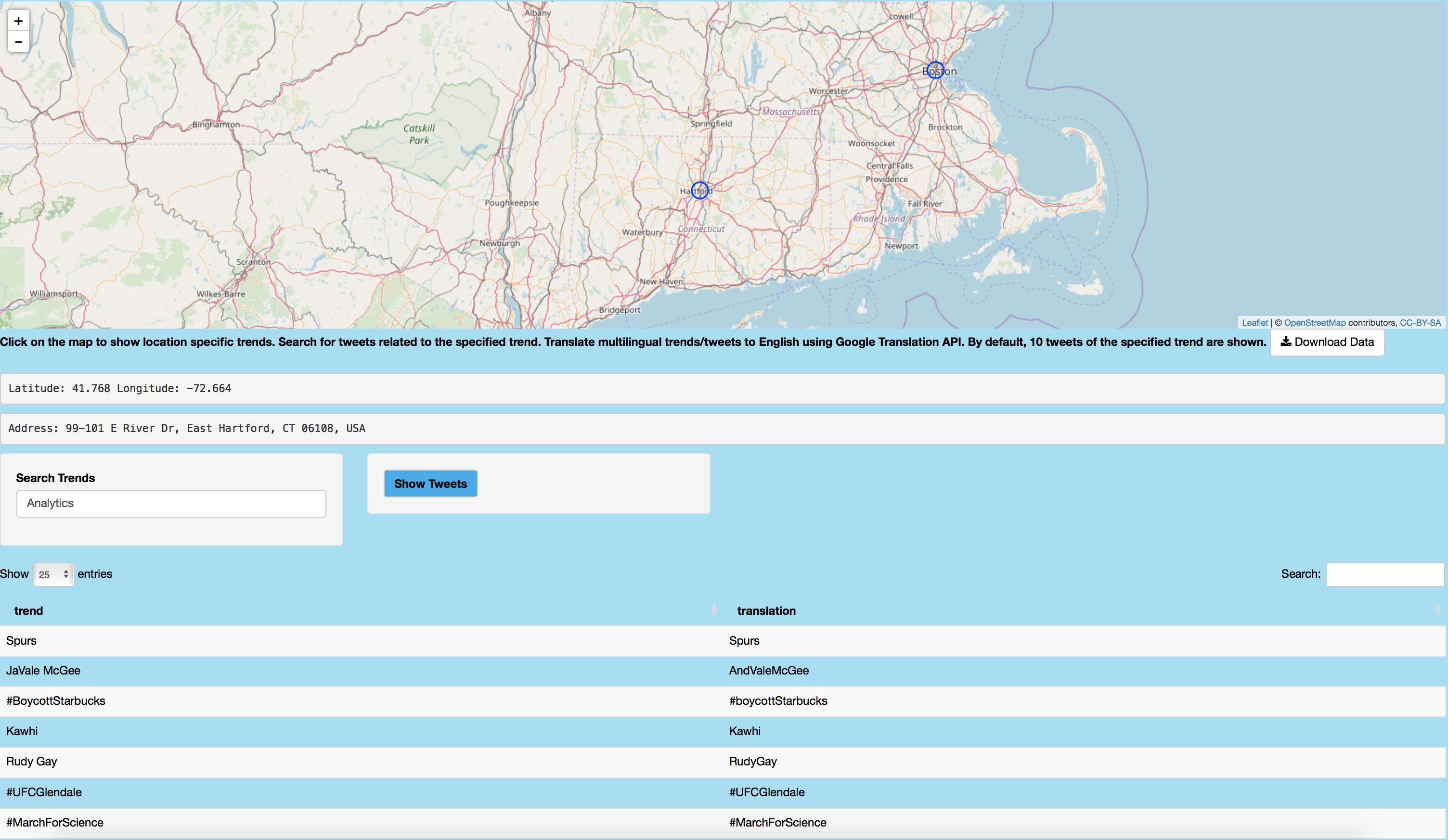
Following image shows trends in East Hartford, Connecticut on April 14, 2018 like #MarchForScience.
Mapping Followers/Following
Next geographic analysis is performed to map user followers and following with public geolocation data. As following code shows, user's followers are retrieved using user$getFriends. Followers' location attribute is then extracted and plotted via leaflet. User click can be used to show publicly available information about that follower, including his/her screen name, description, location, friend, status and favorites count and account creation date. In addition, ten tweets of that follower are shown in a table.
## Mapping Following
### Retrieve location data for the specified user's following
datasetFollow1 <- eventReactive(input$showFollowingMap, {
  user <- getUser(input$twitterUser10)
  follower <- user$getFriends(n = input$tweetNum10)
  progress22 <- shiny::Progress$new()
  on.exit(progress22$close())
  progress22$set(message = "Calculating following data", value = 0)

  datFrame <- data.frame()
  datFrame <- twListToDF(follower)
  datFrame <- datFrame %>% dplyr::select(screenName, location)
  empt <- subset(datFrame, location != "")
  empt$location <- as.character(empt$location)

  lon <- vector("double", nrow(empt))
  lat <- vector("double", nrow(empt))
  for (i in 1:nrow(empt))
  {
    lon[[i]] <- try(geocode(empt$location[i])$lon)
    lat[[i]] <- try(geocode(empt$location[i])$lat)
    progress22$inc(1 / nrow(empt), detail = paste("Data for following", i))
  }
  ll.visited <- as.data.frame(cbind(lon, lat))
  Tab2 <- ll.visited
  Tab3 <- cbind(Tab2, empt)
  return(Tab3)
})

### Map the following of the specified user
output$mapFollowing <- renderLeaflet({
  Tab2 <- datasetFollow1()
  Tab2 <- na.omit(Tab2)
  visit.x <- as.numeric(as.character(Tab2$lon))
  visit.y <- as.numeric(as.character(Tab2$lat))
  map2 <- leaflet() %>%
    addTiles(options = providerTileOptions(noWrap = TRUE)) %>%
    addCircleMarkers(
      lng = visit.x, lat = visit.y, group = "circles",
      weight = 6, radius = 4, color = "#00aced",
      opacity = 1
    )
  return(map2)
})

### Retrieve user attribute information for the chosen following
observeEvent(input$mapFollowing_marker_click, {
  loc2 <- datasetFollow1()
  loc2 <- na.omit(loc2)
  p <- input$mapFollowing_marker_click
  lat1 <- p$lat
  lon1 <- p$lng
  loc2$lon2 <- as.factor(loc2$lon)
  loc2$lat2 <- as.factor(loc2$lat)
  datsmall <- subset(loc2, lat2 == lat1 & lon2 == lon1)
  datsmall <- datsmall[, !(colnames(datsmall) %in% c("lon2", "lat2"))]
  Name <- vector("character", nrow(datsmall))
  Description <- vector("character", nrow(datsmall))
  FavoritesCount <- vector("double", nrow(datsmall))
  FriendsCount <- vector("double", nrow(datsmall))
  StatusCount <- vector("double", nrow(datsmall))
  AccountCreated <- vector("character", nrow(datsmall))
  ScreenName <- vector("character", nrow(datsmall))
  Location <- vector("character", nrow(datsmall))
  for (i in 1:nrow(datsmall))
  {
    user <- getUser(datsmall$screenName[i])
    Name[[i]] <- user$name
    Description[[i]] <- user$description
    FavoritesCount[[i]] <- user$favoritesCount
    FriendsCount[[i]] <- user$friendsCount
    StatusCount[[i]] <- user$statusesCount
    AccountCreated[[i]] <- as.character(try(date(user$created)))
    ScreenName[[i]] <- datsmall$screenName[i]
    Location[[i]] <- datsmall$location[i]
  }
  userdes <- data.frame(cbind(
    ScreenName, Name, Description, Location,
    FriendsCount, StatusCount, FavoritesCount,
    AccountCreated
  ))
  output$followingDescription <- renderDataTable({
    return(userdes)
  })
})
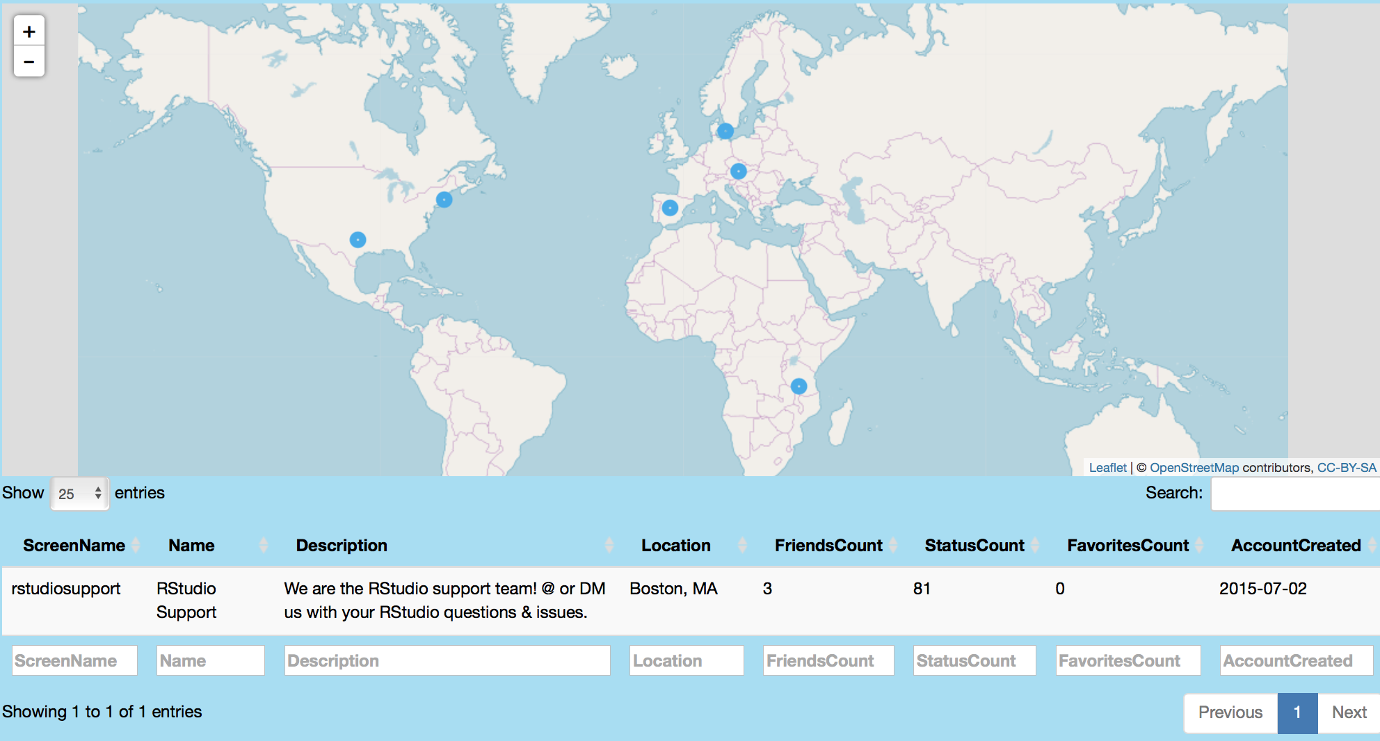
Following image maps 25 of rstudio's following. Point click shows users like rstudiosupport and associated tweets.
Mapping Tweets
This feature facilitates a global visualization of location enabled tweets for a specific topic. Since the vertices can be colored by hour or weekday status, global trend/movement of tweets about a particular topic can be assessed over time. As code shows below, location information for tweets is extracted and plotted using leaflet. Circle markers can be clicked to obtain location, tweet text, time of day, retweet, favorites, statuses, followers and friends count information.
### Retrieve mapped tweets data
mapTweetsData <- eventReactive(input$showMapTweets, {
  tweets <- searchTwitter(input$twitterUser12, n = 500)
  tweetFrame <- twListToDF(tweets)

  userInfo <- lookupUsers(tweetFrame$screenName)
  userFrame <- twListToDF(userInfo)

  full <- inner_join(tweetFrame, userFrame, by = c("screenName" = "screenName"))
  full$location <- iconv(full$location, to = "ASCII", sub = NA)
  full2 <- subset(full, location != "NA" & location != "")

  userFrame <- full2
  user2 <- sample(userFrame, input$tweetNum12)
  user2$date <- as.Date(user2$created.x)
  user2$year <- year(user2$date)
  user2$year <- as.factor(user2$year)
  user2$month <- as.factor(months(user2$date))
  user2$weekday <- as.factor(weekdays(user2$date))
  user2$hour <- hour(with_tz(user2$created.x, "EST"))

  progress3 <- shiny::Progress$new()
  on.exit(progress3$close())
  progress3$set(message = "Calculating table", value = 1)

  loc <- data.frame()
  amt <- nrow(user2)
  for (i in 1:amt)
  {
    dat1 <- data.frame(try(geocode(user2[i, ]$location)))
    progress3$inc(1 / amt, detail = paste("Data for user", i))
    loc <- rbind(loc, dat1)
  }
  loc$location <- user2$location
  loc$retweetCount <- user2$retweetCount
  loc$year <- user2$year
  loc$text <- user2$text
  loc$weekday <- user2$weekday
  loc$hour <- user2$hour
  loc$month <- user2$month
  loc$screenName <- user2$screenName
  loc$favoritesCount <- user2$favoritesCount
  loc$followersCount <- user2$followersCount
  loc$friendsCount <- user2$friendsCount
  loc$statusesCount <- user2$statusesCount
  loc2 <- subset(loc, lon != "NA" & lat != "NA")
  incProgress(0.2, detail = "Finishing...")
  loc3 <- loc2 %>% dplyr::select(
    lon, lat, location, screenName, text, hour, weekday, month, year,
    retweetCount, favoritesCount, statusesCount, followersCount, friendsCount
  )
  return(loc3)
})

### Plotting geolocated tweets and associated data
output$mapTweets <- renderLeaflet({
  withProgress(message = "Application loading", value = 0, {
    incProgress(0.8, detail = "Getting tweets")
    loc2 <- mapTweetsData()
    var <- input$circleColor
    factpal <- colorFactor("viridis", loc2[, var])
    leaf <- leaflet() %>%
      addTiles(options = providerTileOptions(noWrap = TRUE)) %>%
      addCircleMarkers(
        lng = loc2$lon, lat = loc2$lat,
        group = "circles",
        color = as.factor(factpal(loc2[, var])),
        weight = loc2[, input$circleCount] * input$circleSize,
        fillColor = "black", radius = 5
      )
    if (var == "hour") {
      leaf <- leaf %>% addLegend(pal = factpal, values = as.factor(loc2[, var]))
    }
    else {
      leaf <- leaf %>% addLegend(
        pal = factpal, values = (loc2[, var]),
        position = "bottomleft"
      )
    }
    incProgress(0.2, detail = "Finishing...")
    return(leaf)
  })
})
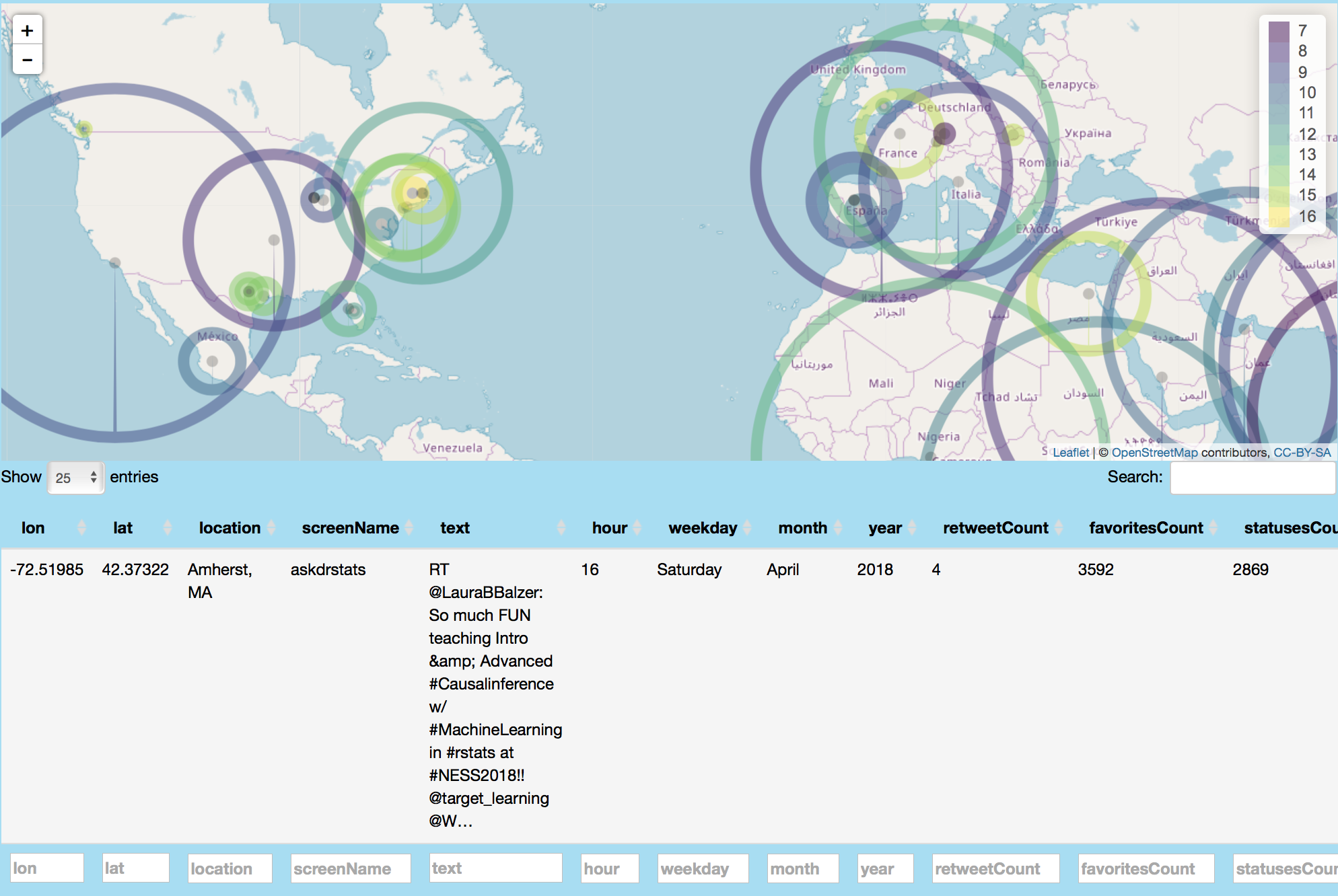
This image globally maps #rstats related tweets and shows an example retweet related to #rstats from askdrstats in Amherst, Massachusetts.
Network Analysis
Retweets Network
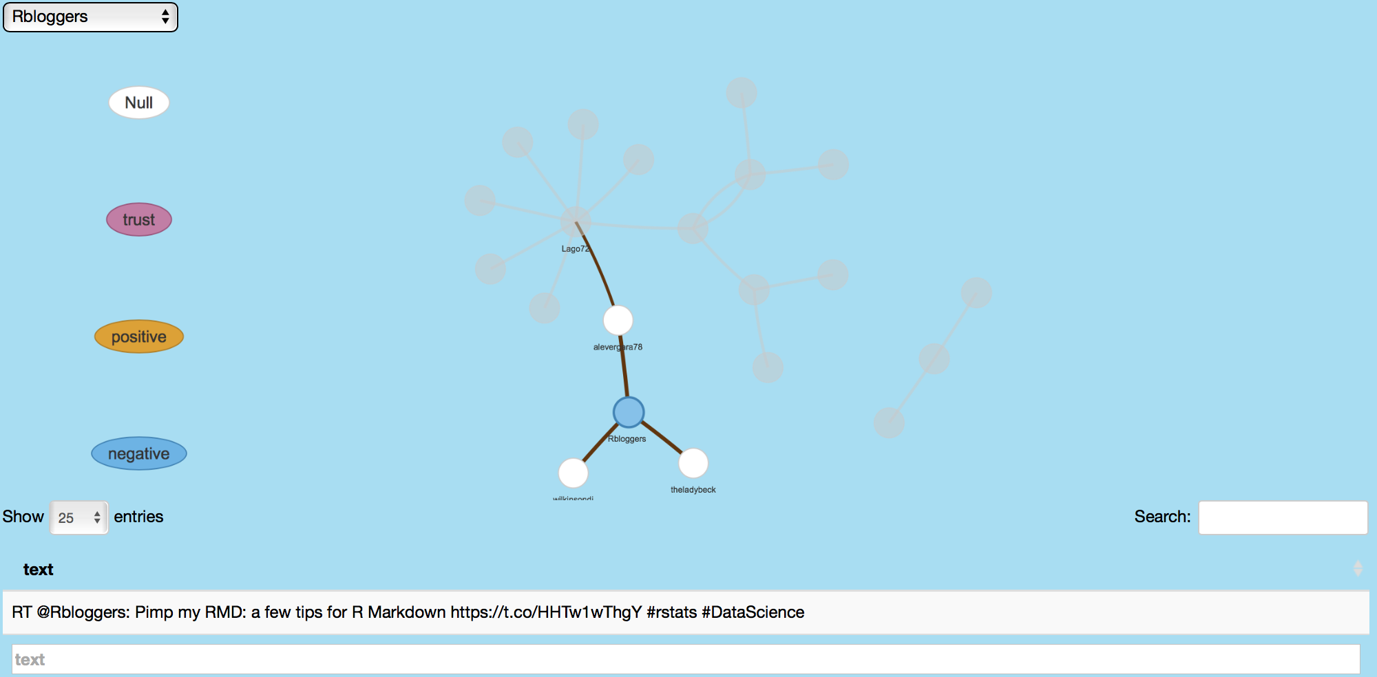
For this feature, a topic's influence is assessed by searching mentions of retweets involving that topic. Sentiments of those retweets are assessed and distinguished by emotions like anger, anticipation, disgust, fear, joy, negative, positive, sadness, surprise, trust and null using the NRC Emotion Lexicon.
This image shows retweets related to #rstats.
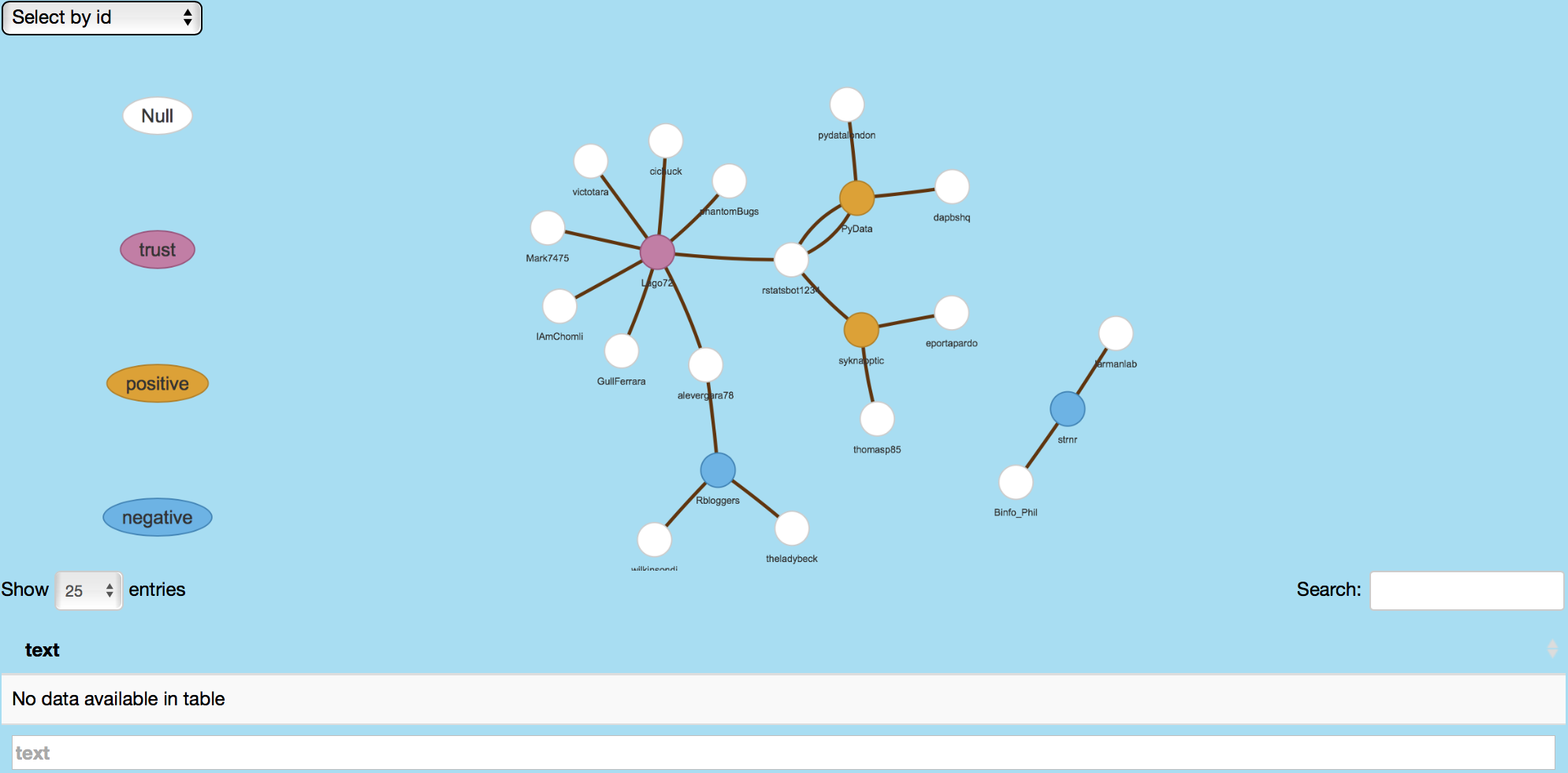
Following image shows Rbloggers' retweeted tweets as well as the retweet users.
Following/Follower Network
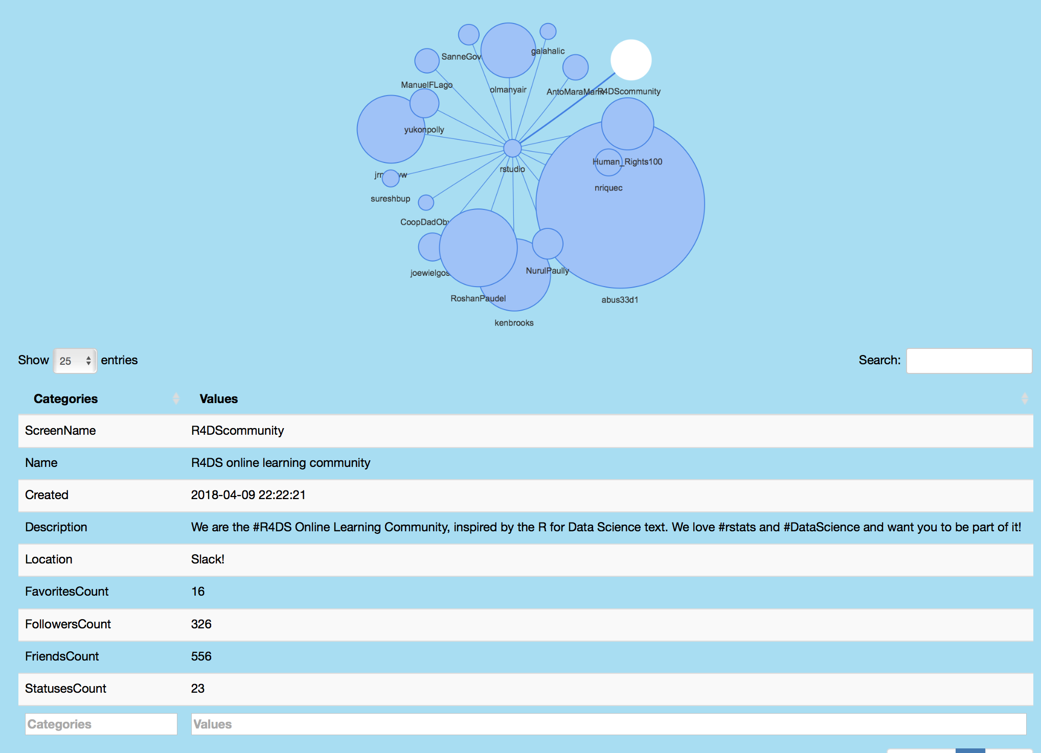
Following/Follower network analysis feature shows individuals followed by a specified user. Magnitude of the following user vertex corresponds to the number of followers for that individual. Vertex click displays follower's screen name, description, location and friends, followers and status count amongst other information. For plotting, edges and nodes are defined and passed as arguments to the graph_from_data_frame function from the igraph package, which creates an igraph from the dataframe containing an edge list and edge/vertex attributes. This information is then passed as argument to the visNetwork function from the igraph package.
Following image shows rstudio's followers as well as Twitter user information for R4DScommunity.
Emoji Analysis
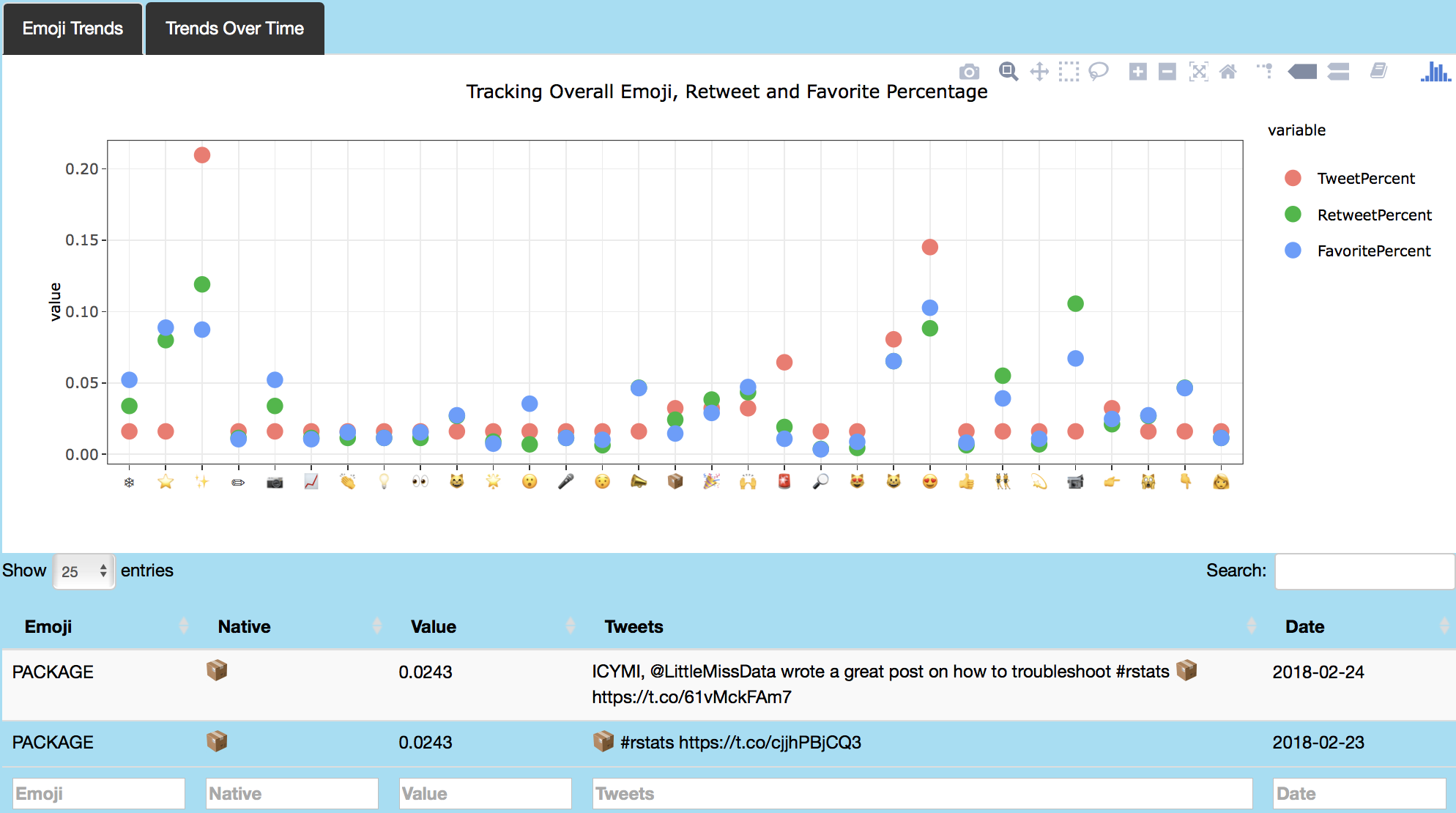
Last feature of this application performs emoji analysis of tweets in a user's Twitter timeline, favorites and topic tweets. This features uses the emojis data from today-is-a-good-day's emoji repository, which provides R-encoding for emojis. Code below shows how emoji data is retrieved in appropriate encoding and plotted using ggplotly. Each point can be clicked to retrieve the tweet associated with the marked emoji. Trends in emoji use are also visualized over time. See the user interface and server files for further information about the code for this section.
Following image shows emoji analysis on my favorite tweets.