Import packages
library(ggplot2)
library(plyr)
Pie chart plot of miles per gallon, mpg, against weight, wt, by number of forward gears, gear, from mtcars dataset
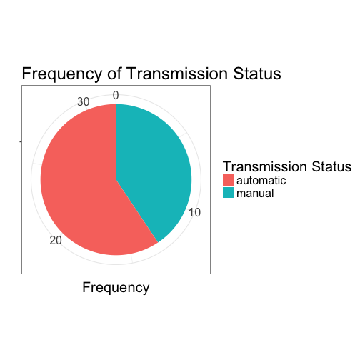
tab <- data.frame(table(mtcars$am))
colnames(tab) <- c("Transmission", "Frequency")
tab$Transmission <- revalue(tab$Transmission, c("1" = "manual", "0" = "automatic"))
ggplot(tab, aes(x = "", y = tab$Freq, fill = tab$Transmission)) + geom_bar(width = 1, stat = "identity") + coord_polar("y", start = 0) + scale_fill_discrete(name = "Transmission Status") + xlab("") + ylab("Frequency") +
  ggtitle("Frequency of Transmission Status") + theme_bw() + theme(text = element_text(size = 20))