Import packages
library(plyr)
library(reshape2) # for melt function
library(ggplot2)
Reading and Cleaning Wisconsin Breast Cancer Dataset from UCI Machine Learning Repository
breast_cancer <- read.csv("https://archive.ics.uci.edu/ml/machine-learning-databases/breast-cancer-wisconsin/breast-cancer-wisconsin.data")
colnames(breast_cancer) <- c("Code", "ClumpThickness", "UniformCellSize", "UniformCellShape", "MarginalAdhesion", "EpithelialCellSize", "BareNuclei", "BlandChromatin", "NormalNucleoli", "Mitoses", "Class")
breast_cancer$Class <- as.character(breast_cancer$Class)
breast_cancer$Class <- revalue(breast_cancer$Class, c("2" = "Benign", "4" = "Malignant"))
breast_cancer$Class <- as.factor(breast_cancer$Class)
breast_cancer <- breast_cancer[!(breast_cancer$BareNuclei == "?"),] # dropping all observations with BareNuclei value of "?"
breast_cancer$BareNuclei <- as.integer(breast_cancer$BareNuclei)
Reshaping data using melt
reshape <- melt(breast_cancer, id.vars = c("Code", "Class"))
#reshape$variable <- plyr::revalue(reshape$variable, c("ClumpThickness" = "Clump", "UniformCellSize" = "UniCell",
#                                                "UniformCellShape" = "UniShape", "MarginalAdhesion" = "MarAdhe",
#                                                "EpithelialCellSize" = "EpiSize", "BareNuclei" = "BareNuc",
#                                                "BlandChromatin" = "Chrom", "NormalNucleoli" = "Nucleo",
#                                                "Mitoses" = "Mitoses"))
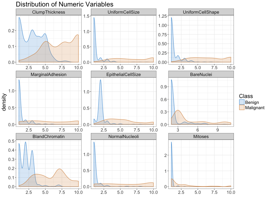
Reshaping data and plotting all continuous predictors using density plots
ggplot(data = reshape, aes(x = as.numeric(value), color = Class, fill = Class), lty = "longdash") +
  geom_density(alpha = 0.2) + facet_wrap( ~ variable, scales = "free", ncol = 3) + theme_bw() +
  ggtitle("Distribution of Numeric Variables") + xlab("") + scale_fill_manual(values=c("#4598d6", "#d68e45")) + scale_color_manual(values=c("#4598d6", "#d68e45")) + theme(text = element_text(size = 18))
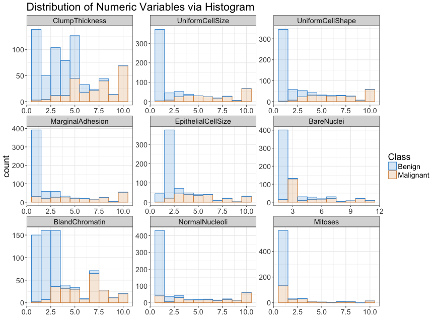
Reshaping data and plotting all continuous predictors using histogram
ggplot(data = reshape, aes(x = as.numeric(value), color = Class, fill = Class), lty = "longdash") +
  geom_histogram(alpha = 0.2, bins = 10) + facet_wrap( ~ variable, scales = "free", ncol = 3) + theme_bw() +
  ggtitle("Distribution of Numeric Variables via Histogram") + xlab("") + scale_fill_manual(values=c("#4598d6", "#d68e45")) +
  scale_color_manual(values=c("#4598d6", "#d68e45")) + theme(text = element_text(size = 18))
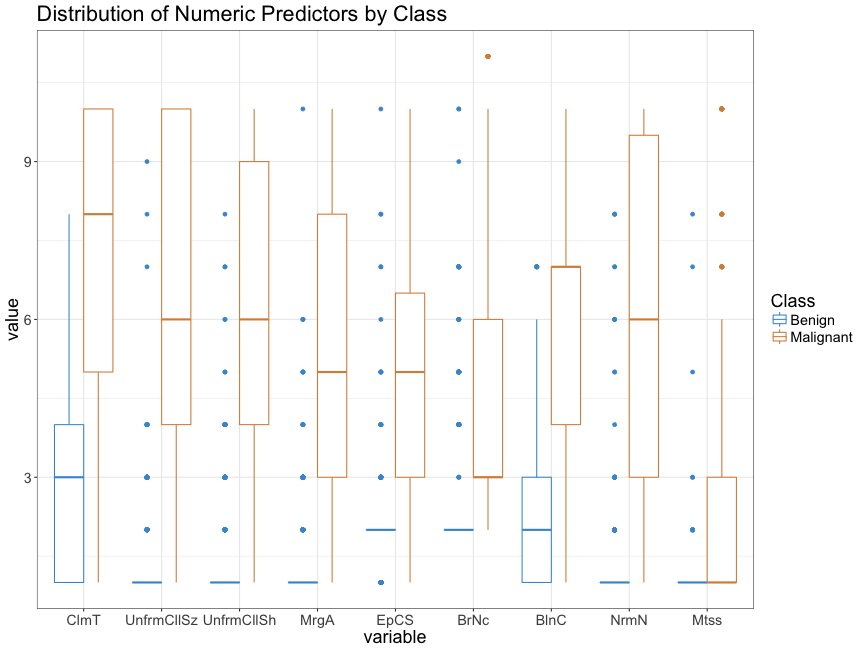
Reshaping data and plotting all continuous predictors using boxplot
ggplot(reshape, aes(x = variable, y = value, color = Class)) + geom_boxplot() + theme_bw() +
ggtitle("Distribution of Numeric Predictors by Class") +
scale_fill_manual(values=c("#4598d6", "#d68e45")) +
scale_color_manual(values=c("#4598d6", "#d68e45")) + theme(text = element_text(size = 18)) + scale_x_discrete(labels = abbreviate)