Import packages
library(leaflet)
library(jsonlite)
library(tibble)
library(plyr)
library(dplyr)
library(data.table)
library(datasets) # loading datasets package for mtcars and Iris data
library(webshot)
Scrape latitudes and longitudes for US states (from Michelle Hertzfeld's GitHub)
url <- "http://gist.githubusercontent.com/ajav17/dee0dd44357862c75ee2872038119f17/raw/0109432d22f28fd1a669a3fd113e41c4193dbb5d/USstates_avg_latLong"
statesLocation <- fromJSON(txt = url)
statesLocation <- plyr::rename(statesLocation, replace = c("state" = "State"))

USArrests2 <- USArrests
USArrests_reshape <- setDT(USArrests2, keep.rownames = TRUE)[]
#USArrests_reshape <- tibble::rownames_to_column(USArrests2) #convert states from row to first column
#USArrests_reshape <- USArrests_reshape %>% dplyr::select(rn, Murder, Assault, UrbanPop, Rape)
colnames(USArrests_reshape) <- c("State", "Murder", "Assault", "UrbanPop", "Rape")

statesFinal <- statesLocation %>% dplyr::inner_join(USArrests_reshape) #join the USArrests dataframe to the states dataset with location
meanPop <- mean(statesFinal$UrbanPop)
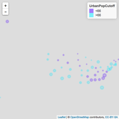
#Creating factor labeling all states less or greater than the average urban population
statesFinal <- mutate(statesFinal, UrbanPopCutoff = ifelse(UrbanPop < round(meanPop), "<66", ">66"))
Coloring states by UrbanPopCutoff predictor
pal <- colorFactor(topo.colors(2), statesFinal$UrbanPopCutoff) #Creating color palette of 2 colors

#Mapping US states where states are color coded as either having urban population less than or greater than the average urban population and the radius of the circle markers represents scaled assault numbers
leaflet(statesFinal) %>% addTiles() %>% addCircleMarkers(lng = ~longitude, lat = ~latitude, radius = ~Assault/50, opacity = 0.2, color = ~pal(UrbanPopCutoff), popup = paste(statesFinal$State, "<br>", "Assaults: ", statesFinal$Assault, sep = "")) %>% addLegend(pal = pal, values = ~UrbanPopCutoff)